Today’s post isn’t going to be an overly positive one but it will be interesting. Please be assured this will be a rare occurrence on my blog. I just felt I had to say something and not let this error go unchecked as no one else seems to have noticed.
As I stated in yesterday’s post, I love Little Women. I think the 2019 film was a masterpiece and I proudly wrote yesterday’s post to show off some of the wonderful graphic props it affords. You can check it out here:
However, there is one prop that appears twice and I deem to be an act of woeful negligence at best. It’s such a prominent prop and this mistake made me blanch when I first noticed it during my second screening of the film.
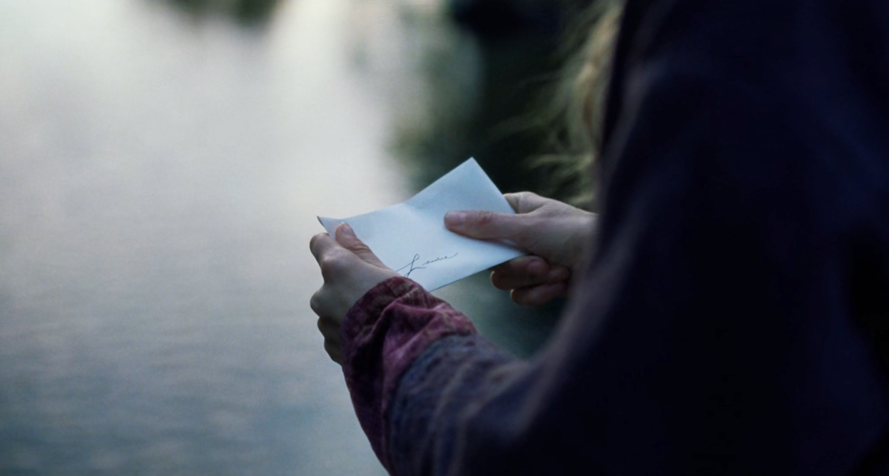
Late in the movie, Jo writes a lovely letter to Laurie, puts it in an envelope with his name on and places it in the wooden post box that the sisters and Laurie have been using to communicate since childhood. All rosy and graphically sound so far. Then, in a subsequent scene, once Jo finds out Laurie has married her sister Amy, she removes the letter from the post box, tears it up, and throws it in a stream… Except, the envelope she takes out of the box, isn’t the same one she put in!!! The name “Laurie” is a full inch lower on the envelope she removes compared to the one she put in. The handwriting makes it worse too, as although it looks like it’s written from the same hand, the large and elegant capital letter “L” has completely different curves to it. The final stroke curves down on the first letter and curves up on the second. All this makes it glaringly obvious that these letters were carelessly designed.
It might have been that only one letter was made and it got lost, or when tearing it up, something went wrong so it had to be re-shot and a new letter was made on the fly. However, there is no excuse for not having multiple copies just in case. That’s a standard precaution every graphic prop maker should take. If no copies were made surly the designer could have referenced their original letter and copied it carefully. I don’t really know how this occurred, it hurts the graphic artist in me more than I can say, but it’s infuriating as the rest of the film’s design is so magnificent.
To the general viewer this error really doesn’t matter and in the grand scheme of the movie it isn’t important. It probably went un-noticed by most but unfortunately as a graphic designer it’s my job to be as accurate and consistent as possible, to tell the best story I can and this didn’t escape my notice. I don’t dislike the film any less because of the blip and I don’t let it affect my viewing experience, I really don’t, and neither should you. I regard Little Women as one of my favourite films of all time and the overall graphic design genuinely is phenomenal.