The Wonderful Graphic Props of Little Women
THE WONDERFUL GRAPHIC PROPS OF LITTLE WOMEN
There are many wonderful graphic props in Little Women and I want to take a closer look at 5 of them today. If you haven’t seen the film yet, what have you been doing since lockdown!? Go and watch it now you fool! Ready? Good. I shall continue…
I want to begin by saying how much I love this film. I think it’s an incredible piece of screenwriting and directing by Greta Gerwig who beautifully adapted Louisa May Alcott’s 1868 book and gave it unique additions that pay homage to Alcott herself. Gerwig’s feminist views shine though the screen and her ability to write a period piece that emotionally connects so beautifully to the feeling and values of a contemporary audience is magic. I saw the film twice in the cinema and watching it reaffirmed my love of graphic props, it was like a warm glow every time a new piece appeared. I needed this lift as I was beginning my final semester of uni and had chosen Graphic Props as my final topic. My feelings while watching Little Women showed me I’d definitely made the right decision. Having looked up Little Women on IMDB, “Carly Sertic” is the only crew member credited as a “graphic designer”, so I believe she would have designed and made most of these props. Also, “Gregory Hill” is credited as an “illustrator” and he might have had a hand in things like shop signage but I assume his main job would have been creating Amy’s paintings. If anyone knows more about who did what, please let me know.
From a design point of view there are so many graphic props we could take a closer look at; from Mr. Dashwood’s office window lettering in the opening scene to the town’s shop front signage that Jo walks past in the snow and even Beth’s letter from Mr. Laurence’s that accompanies her piano. A lot of graphics gets burned in the film, including one of Jo’s early stories by Amy and Jo’s newspaper clippings and note books which she shows to Frederick, then throws in the fire towards the end of the movie. By the way, watching all those lovely graphics go up in flames fully made me wince. There’s also Jo’s letter to Teddy which she tears up and throws into the river before he can read it. I will actually cover this letter on its own in tomorrow’s post… and you’ll see why. I lastly, very much enjoyed the letterpress printing, bookbinding and gilding of Jo’s finished novel at the end. Anyway, the 5 pieces are:
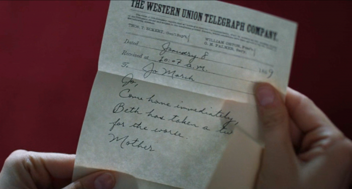
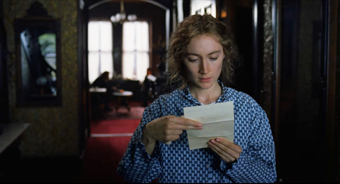
1. Mrs. March’s Western Union telegram asking Jo to come home from New York as Beth’s condition had “taken a turn for the worse”. The handwriting used for Mrs. March is elegant but more importantly, neat so it’s clearly readable when on screen. It’s only front and centre for a few seconds but the audience need to be able to read it in that short time and I think it was a real success on that front. The great thing about graphic props are that they can convey so much without any dialogue. From this telegram we know that Beth is very ill and Marmee wants Jo there, but it also sets a somber tone and lets us know we’ll soon see Jo travelling home in an upcoming scene.
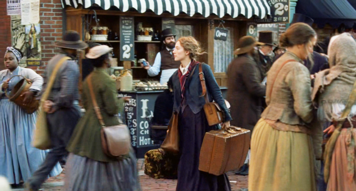
2. Is blink and you’ll miss it New York street graphics. This screenshot shows an amazing set, containing loads of illustrated signage for a street vendor, letterpress playbills on the walls and even artistic posters. As Jo travels to New York, we briefly get a shot of her passing through the streets. It must have taken weeks to design and produce the final graphics for this and it’s sad it only gets a few seconds of screen time at most.
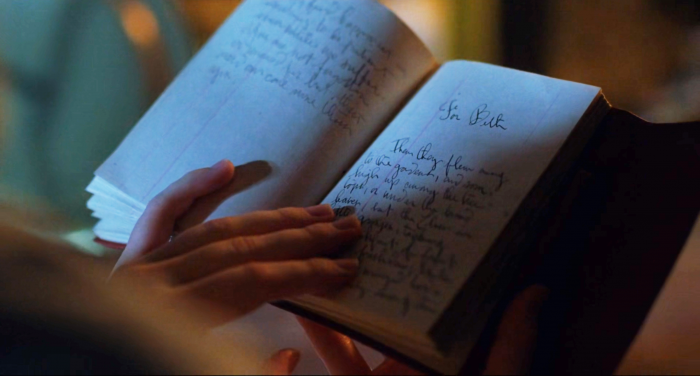
3. This is the only piece of Jo’s writing she decides not to burn as it’s her notebook containing the last story she wrote for Beth. Jo chooses to keep it in her memory, then props it up and uses it as inspiration to tell her domestic coming of age story of four sisters and their friend. What’s great about this piece is that the notebook is actually a cash book and shows good character understanding by the designer. They’ve clearly considered how much money Jo had to spend on equipment and what would have been accessible to her at the time.
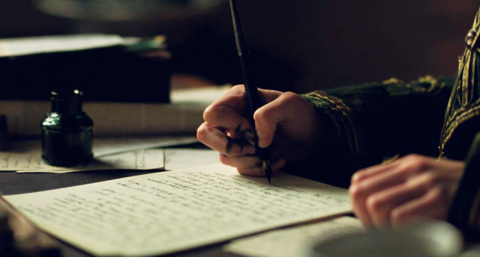
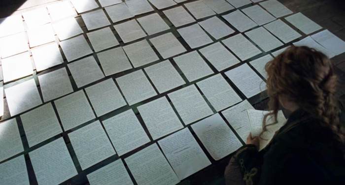
4. This is probably the most exquisite and time consuming of the previously props as it’s Jo’s handwritten book pages. The montage of Jo writing the first few chapters of her story towards the end of the film was wonderful but the writing of the pages themselves must have required a hell of a lot of time and planning. They look phenomenal though, with crossings out and wonky paragraphs. I like how Jo often has inky fingers throughout the film too, demonstrating her vigorous scribbling of stories. Obviously, all those pages were written by a graphic designer or calligrapher, but for the close ups, I’m not sure if Saoirse Ronan did the handwriting herself or if they used a hand double to scribe. Usually in productions, hand doubles are used for the best close-ups, but we see Saoirse writing in several scenes before this and switching hands with her pen too. I think therefore, the close-ups of just Jo’s hand writing in this montage could be Saoirse herself. This adds even more realism to the film which is wonderful.
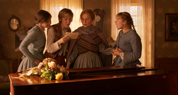
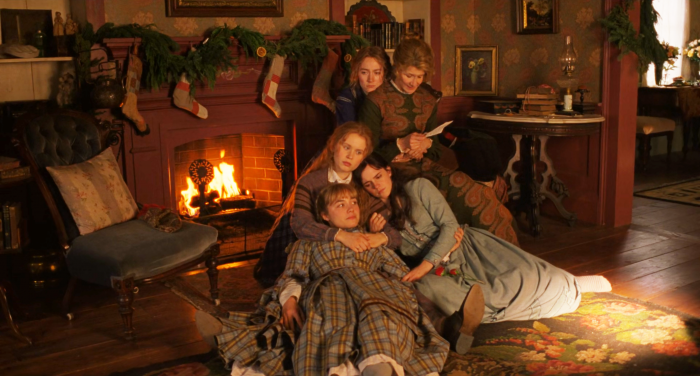
5. Finally, I have to mention a piece of graphic design that is central to a very important, emotional and heart-warming scene. Mr. March’s letter to his little women and Marmee. It’s read by Laura Dern, with all four girls sat around her and although physically small on screen, it plays a big part. The scene couldn’t function without the letter and as a graphic designer, to be able to make such an instrumental prop, is what that job is all about.

