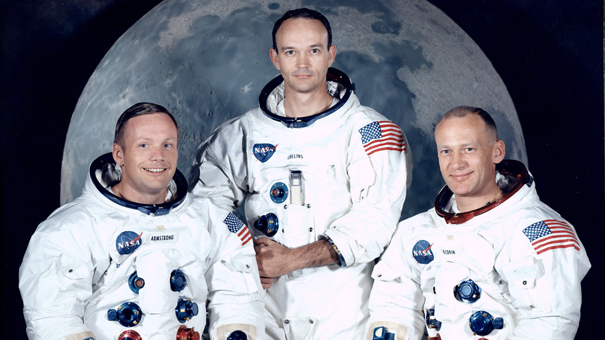
On the 1st October 1958, The National Aeronautics and Space Administration (NASA) was founded in the United States. An independent agency of the U.S. federal government, it was responsible for the aeronautics programme and space research. An initial logo was commissioned and designer James Modarelli was tasked with representing the agency graphically. In 1959, Moderelli finished his design. A patriotic red chevron wing, piercing a bold blue sphere to represent a planet, dotted with white stars, and an orbiting spacecraft. It was nicknamed “the meatball” by NASA employees and this iconic design we associate with the space agency today. Oddly, the meatball hasn’t always been NASA’s insignia though.
During the 1970s many US companies, including NASA, got a make-over, as an attempt to modernise the face of America. The US Federal Design Improvement Program was an initiative instigated by the National Endowment for the Arts and President Richard Nixon. Under this scheme, more than 45 federal agencies, including The Department of Agriculture and The National Zoo, had their graphics critiqued and redesigned. With ‘70’s technology, the meatball was a difficult icon to reproduce, print, and many people considered it a complicated metaphor in what was then considered, a new and modern aerospace era.
New York design studio “Danne & Blackburn” was tasked with the job of creating a modern logo for NASA. The two young designers, Bruce Blackburn and Richard Danne, had only recently opened their firm in New York, not a bad early commission as it goes. In a 2015 interview, Blackburn said they set out to create something “very simple, very direct, otherworldly, unexpected, something that you would remember, for sure.”
Richard Danne, design director of the project recalls, “The meatball was complicated, hard to reproduce and laden with Buck Rogers imagery. Clearly it was born out of the classic airman syndrome where hype and fantasy dominated over logic and reality. Our proposed logotype was quite the opposite. It was clean, progressive, could be read from a mile away and was easy to use in all mediums.” Danne and Blackburn didn’t just create a new logo, they worked up design standards to demonstrate how the logo should be used. The logo they came up with was versatile and worked for a host of applications, demonstrating a well-considered brand identity. “This was a coordinated, comprehensive design programme, not just another ornamental badge to be stuck on a multitude of different products.” said Danne.
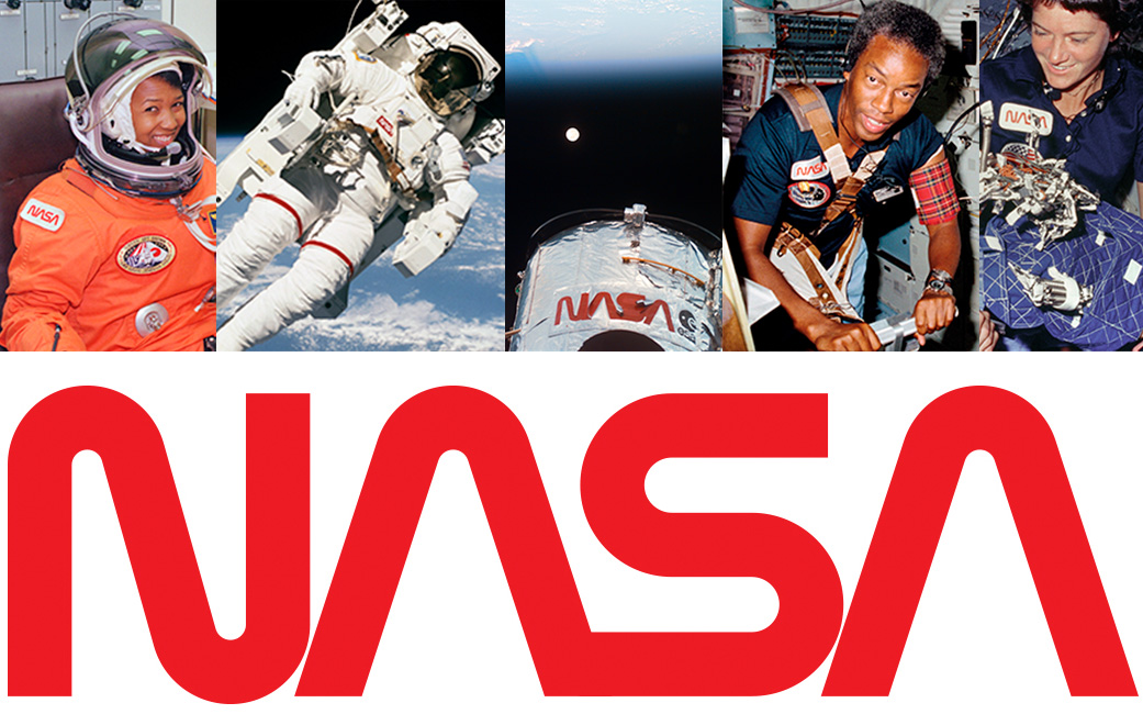
From left, Astronaut Mae Jemison preparing for launch, Astronaut Bruce McCandless on an untethered spacewalk, the Hubble Space Telescope, Astronaut Guy Bluford, and Astronaut Sally Ride.
In 1975 the new logotype was rolled out, but the design was not well received by NASA staff who’d become fond of the iconic meatball symbol, which they wore with pride. Bill Barry, NASA’s chief historian said “I think the big problem was how it was announced. It was developed by a very small team and only a few people at NASA knew anything about it. Many found out the old logo was being obliterated when new letterhead paper was shipped to them from headquarters, with no further explanations. People were just incensed.”
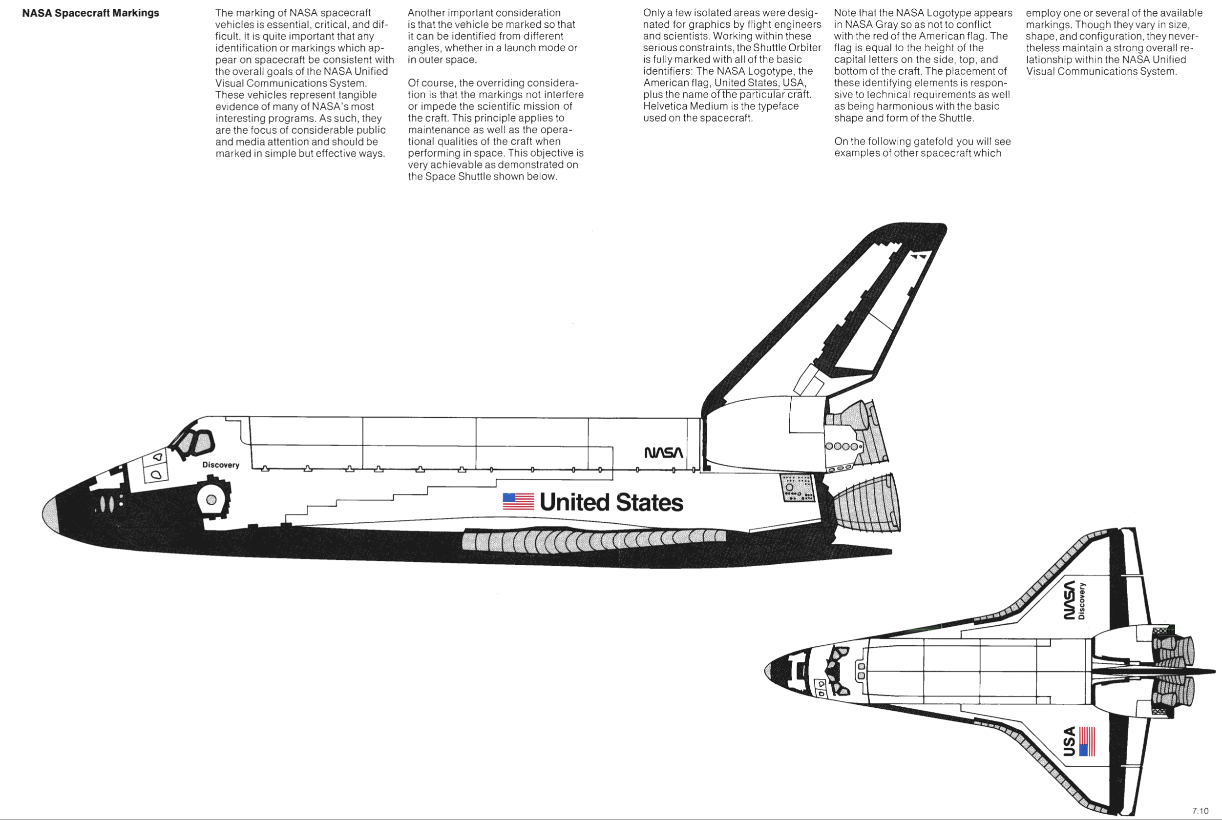
Personally, I love the simplistic, curved design of the logotype and its bold red tone. It even looks modern by today’s standards. After a while, employees nicknamed their new insignia “the worm”, a rite of passage for a NASA logo, and over time, the world got accustomed to the new style too. Below are a couple of wonderful pages from NASA’s “Graphics Standards Manual” from January 1976. One page is titled “The Logotype, Incorrect Uses”, and I love viewing all the ways the worm must not be used. This was vital to keeping brand identity cohesive across so many aspects of the agency. The manual also contains the colour scheme standards, depicting a special shade called “NASA Red”. The manual details the size and positioning for the logo on documents, posters, clothes, cars, planes, space shuttles and even satellites, some of which are still in operation today. The logo was even honoured in 1984 by President Reagan for its simplistic, yet innovative design.
However, in 1992, NASA executives made the decision to retire the worm and bring back the meatball! This was met with even more complaints than before, as the worm was now regarded with great fondness by many. Soon the worm was left behind, occasionally being printed on NASA’s retro line of merchandise but removed everywhere else… until now! This year, in 2020, the beloved worm makes its return. It first featured in huge letters across the side of the Falcon 9 rocket, which ferried Bob and Doug to the International Space Station on 30th May as part of the new Launch America partnership between NASA and SpaceX.
The logo has once again been painted along the walls inside NASA’s headquarters and I think this logotype has returned for several reasons. The design harks back to an era when America ruled space exploration and now as they are once again launching rockets from American soil, after several decades without doing so, this seems a fitting way to represent the return of the good old days. I also think this signals a new era for space travel, with things like flights to Mars just around the corner, the retro yet modern logo really reflects the minimalistic values of contemporary design. It also helps keep up with the slick and shiny design style of SpaceX. NASA could have started to look old and a little stuck in the past next to this very young and futuristic corporation. It might have been tempting to design another new and ‘modern’ logo, but by bringing back the worm they’ve cleverly kept up with the times stylistically, meanwhile honouring their global legacy, something SpaceX doesn’t have yet. It’s time to dust off the old graphics standards manual and I think it’s great to see the simple but striking logotype of the 1970s back again.