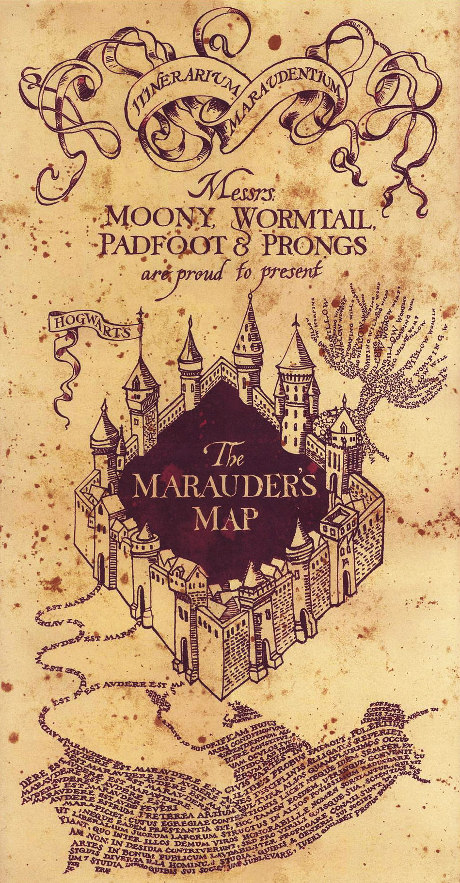
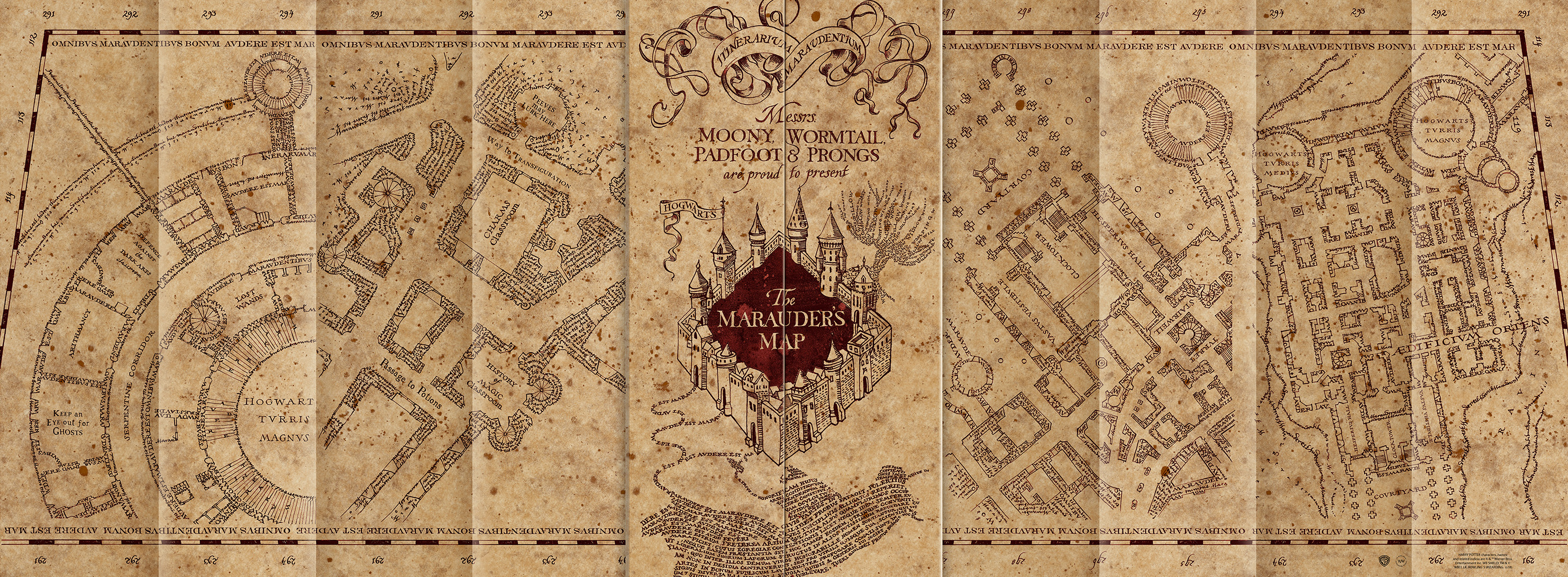
This is the iconic Marauder’s Map from the Harry Potter films. It was hand drawn by the marvellous Miraphora Mina, one half of MinaLima, the graphic designers of the Harry Potter and now Fantastic Beasts films too. I’ve met Miraphora Mina and Eduardo Lima in person 2 or 3 times now and they really are the most lovely and talented people you could imagine.
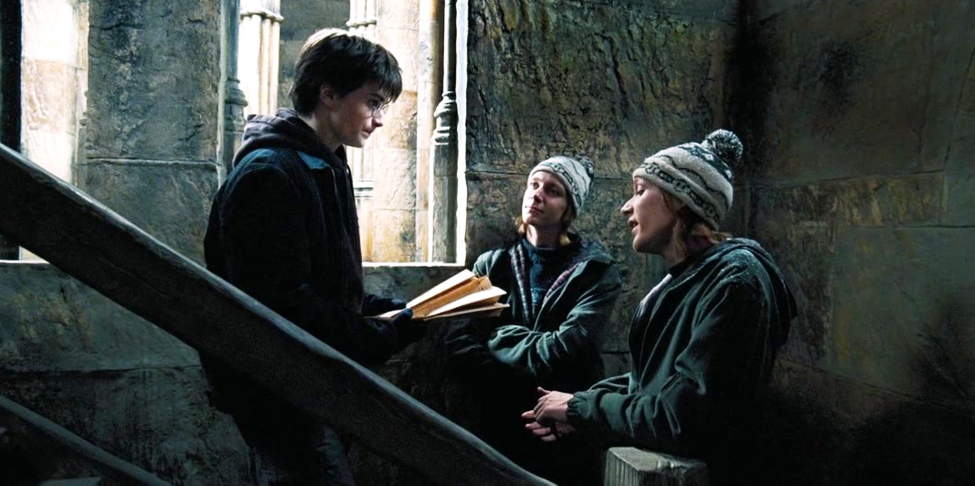
The Marauder’s Map is a masterpiece of a graphic prop that mixes wayfinding design with art, illustration and incredible paper mechanics. It first features in Harry Potter and the Prisoner of Azkaban (my favourite of the eight films) and has a good story behind the design process.
The creation is quite amazing, as I mentioned above it was drawn entirely by hand. The illustration of the Whomping Willow on the cover for instance is made up of tiny text saying Whomping Willow and shaped to look like a trunk and branches, it’s quite beautiful. However, in the original design Miraphora, despite her perfectionist efforts is only human and made the tiniest mistake and misspelled Whomping as “Womping”. I can’t imagine the sinking feeling when she realised, after so many painstaking weeks of illustration final complete, that she’d made that minimal but still visible mistake. The error was fixed for the film, I’m not sure if Miraphora actually drew a whole new map by hand or just designed another tree that was digitally edited over the original one in post-production. Either way, we’ve all made spelling mistakes in our time, but this one had to hurt. What’s even more interesting though, is if you have a copy of the Marauder’s Map prop in your home (which you almost definitely do) look at the Whomping Willow on the front cover. My copy of the map, and I believe most others, read “Womping” as they were produced from the misspelled original. I think this adds character to the map however, as the 16 year old characters of; James, Sirius, Remus and Peter would probably have got at least some spellings wrong when writing their map. Miraphora’s mistake lives on and you know what, I’m happy it does.
It’s not every day you create a globally recognisable graphic prop and Miraphora should be really proud of her design. Take a close look at the immense design detail in these images, or even better, on yours at home. See just how much confusion and creativity would have gone into making this prop that incredibly didn’t just look visually amazing on screen, but also met everyone’s expectations of how the map should have looked from the books too.

It is for our Christmas theme this year Harry Potter