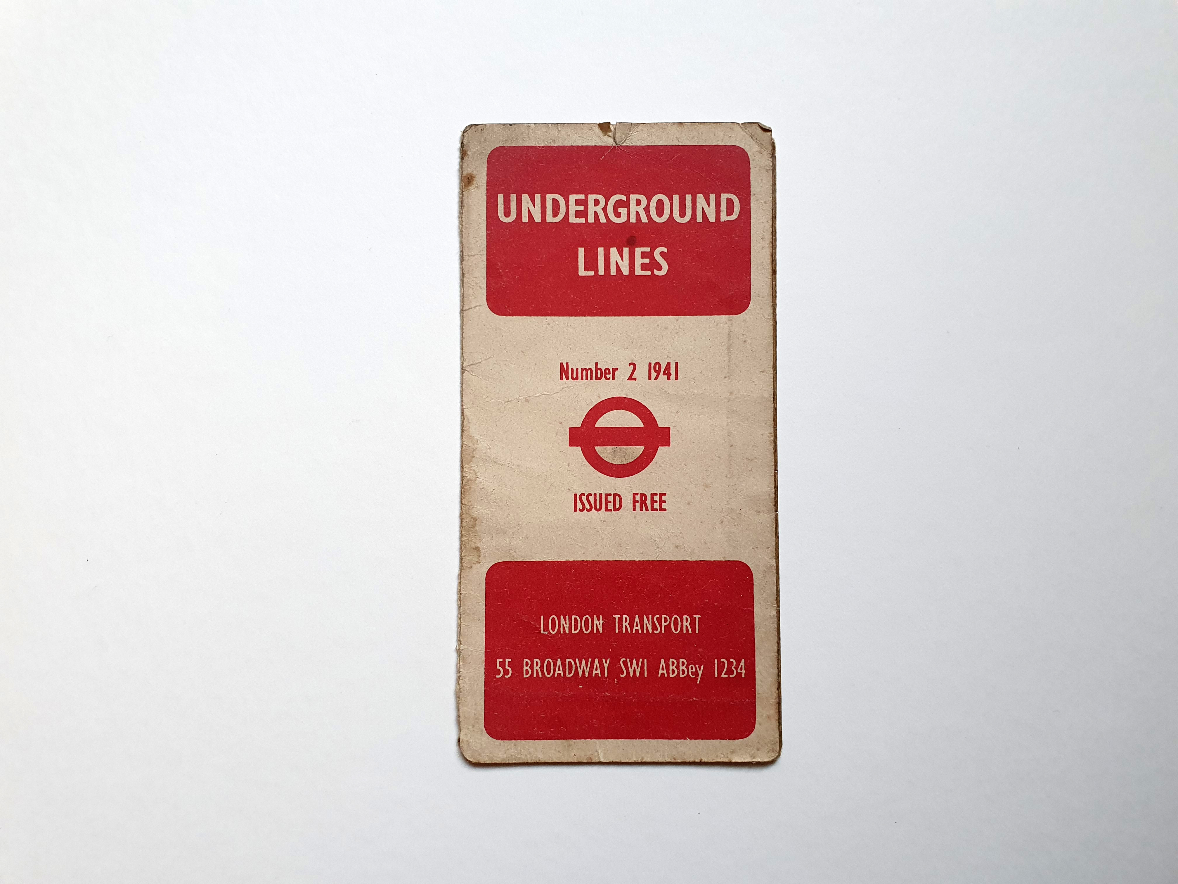
This is a well-used map of the London Underground from 1941. It came from my Great-Grandmother’s house a few years ago and I love the feel of the old, soft, uncoated stock from the era. We spent lots of time going to and from London when I was a kid, as much of my family lived there, so the tube map has a special place in my heart. I feel nostalgic about the fun we had seeing family who would take us on fun days out with them to see the sights of the city. This map probably wasn’t bought by my family back in 1941, it’s likely my Grandmother bought it in a second-hand shop after she got married and moved to London back in the 1960s. She would have sent to her Mum (my Great-Grandmother) as a fun and useful guide to her new home city. This map was well used by my Great-Grandmother though, as it would have been very useful when going to London to visit her daughter back in the day and the tape holding the right panel on shows it’s been well travelled and well loved.
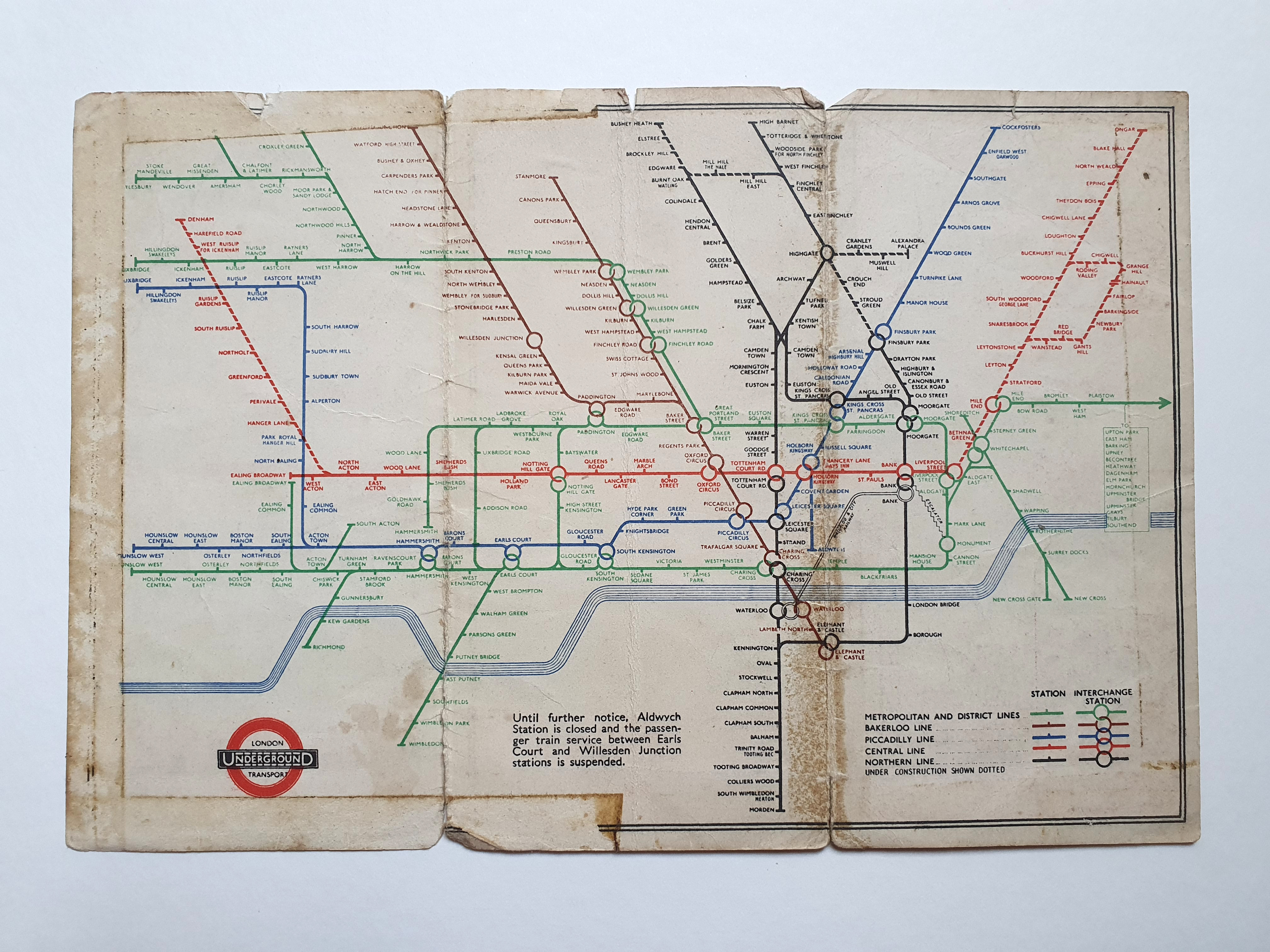
From the big red letter “X”s marking important stations to the simplistic 2 colour printing of black and red colours on the front fold-out face shows it’s very much of its time and a great example of late ‘30s and early ‘40s graphics. From a historical point of view, looking at the inner, fold-out face, it’s fascinating finding stations that are no longer in use such as the branch off the Northern Line from Highgate to Alexandra Palace. If you know your stations well you can even try and spot what’s missing as there are many stations hadn’t been built yet.
This map was printed just 8 years after the classic but initially ‘radical’ tube map design was first created. The graphic designer who pioneered the style was Harry Beck back in 1933. Beck was actually an electrical draughtman and you can see how his understanding of circuits and diagrams influenced his style of map design.
Quite possibly the most iconic wayfinding design to date, it’s so beautifully simple and clean. Beck stripped the concept of the London Underground down to its bare minimum, understanding that distance, wasn’t an integral factor on the highspeed tube network and so simply disregarded geographical accuracy. Simply naming the stops and color-coding the lines they were found on was innovative, brave and the key to simplicity.
The London publicity department initially rejected the map because it was too radical, but when a trial run was done on the general public, it was an instant success and so Beck’s superiors gave in and printed the first run of maps. The design was clear and coherent, even to first-time travellers to the city. Beck’s revolutionary design has been modified over the years, but the basic structure and format is the same. It soon became a template for transport maps all over the world.