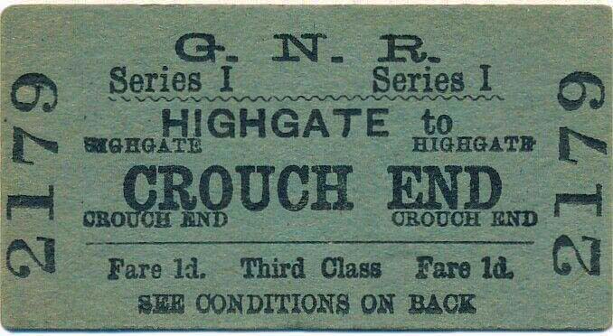
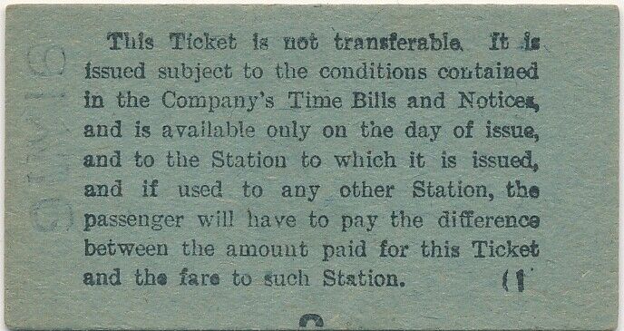
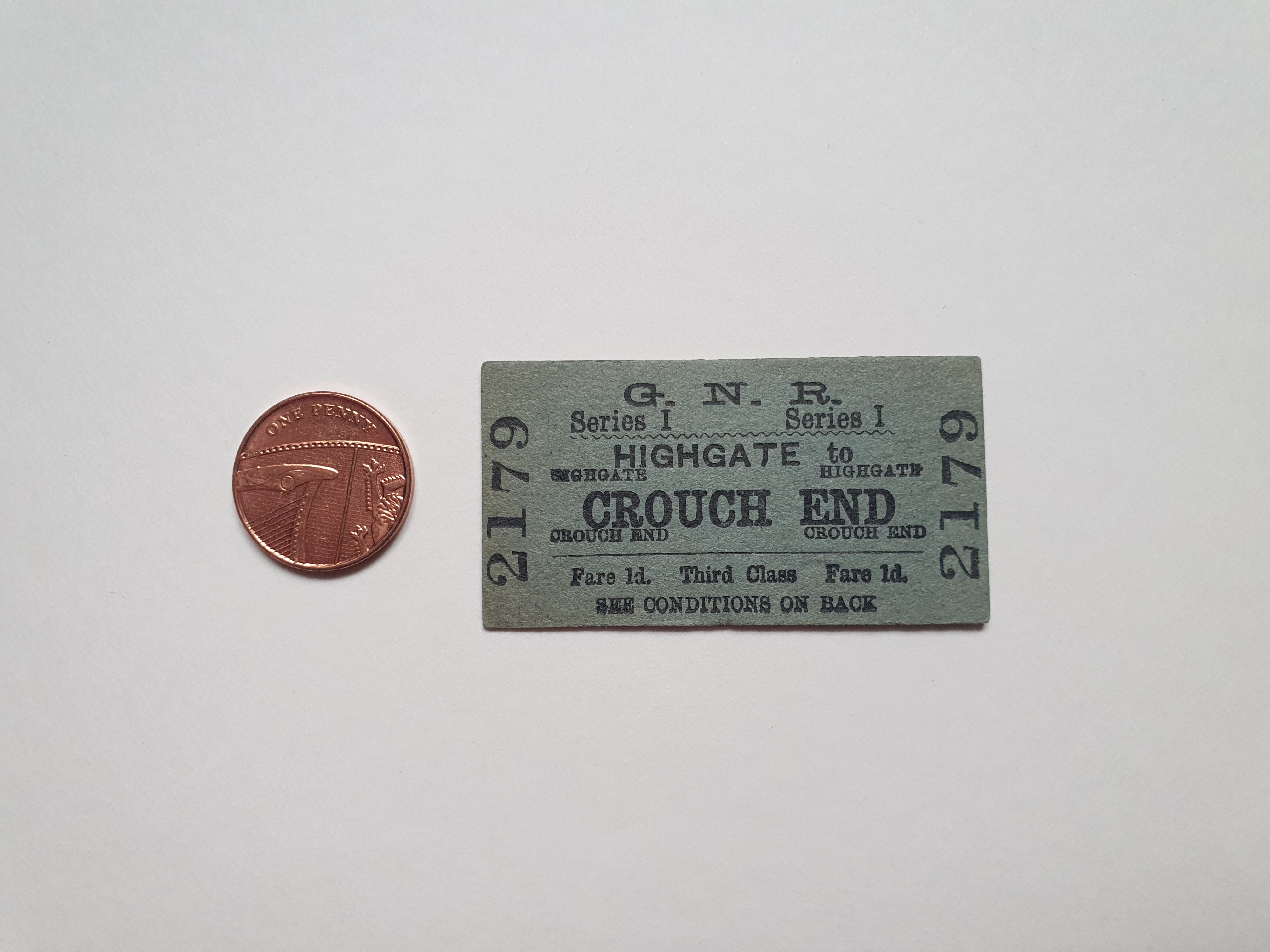
This is a third class, over ground, railway ticket from Highgate to Crouch End in London. It’s stamped on the back with “9MY16” which is the day month and year of issue (9th May 1916). G.N.R. (Great Northern Railway) tickets looked like this from about 1910 – 1970 and it’s tiny, just 57mm wide x 30mm high. Good luck finding that in your handbag.
Of the half dozen vintage train tickets in my collection, this is my favourite as it has a special connection to my family. During my childhood almost all my family lived and still live in London. One set of Grandparents lived in Highgate and my other grandparents lived, and still live, in Crouch End. This ticket connects both sides of my family and so it holds a lot of childhood feelings and memories for me, even though it was never owned by my family until I bought it about 8 months ago.
The Highgate and Crouch End stops weren’t far apart but someone obviously thought the trip was worth the money. However, maybe it was a sunny day and they chose to walk in the end because the ticket isn’t torn which shows it wasn’t used.
Graphically these tickets are really interesting too. The heavy card stock used for these tickets feels strong and natural, unlike the coated, plasticky tickets we use today. The size and minimal processes involved in making them means they’re more environmentally friendly than the modern ones. The variety of typefaces is very much of its time… as in, slightly mad.
A serif typeface is used for the destination name on these tickets, in this case “Crouch End” and in caps to highlight its importance. It’s also uses a lowercase form for most of the other information on the front of the ticket and the body text on the back. So far, fair enough. But then a harshly stretched version of the typeface is used for the G.N.R. logo / acronym. Then there is a completely different serif typeface for the numbers of the ticket up the sides “2179” and lastly, because reasons, the station you’re leaving from, “Highgate”, is in a capitalised sans-serif typeface!? The first station name is the only case where there is a sans-serif typeface on the entire ticket, this seems to be the same for most tickets of this vintage I’ve seen. If anyone knows why, please let me know, I’d love to understand the design decision here. Anyway, the madness and irregularities of old ephemeral objects are all part of the charm I suppose.
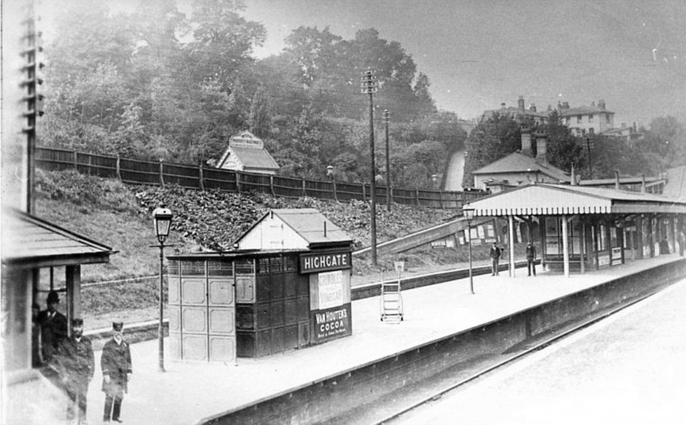
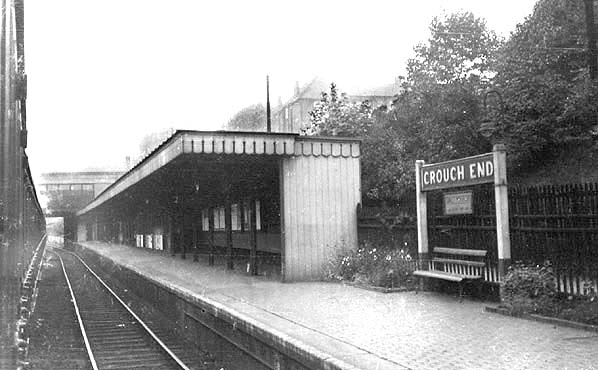
Both Highgate and Crouch End over ground stations are now closed and have been for some time, you can’t even visit them anymore. This ticket and others like it are now little pieces of history, mementoes of times gone by and you can have one of your very own. If you’ve got a few pounds knocking about, go on eBay (not spon), search your local stations and pick yourself up a little piece of the past. This ticket is 104 years old and it was genuinely just a few quid. Each one of these tickets has a story behind it and a person that bought it who either did, or didn’t go on a journey and that’s pretty amazing.
Post Views:2,469
1 thought on “Highgate to Crouch End Railway Ticket (1916)”
You can still walk through the little that’s left of Crouch End station , along a parkland walk that runs from Highgate to Finsbury Park, but Highgate Station is, indeed, sadly cut off from public access. Back in the 80’s we used to go through the tunnels at the Highgate end of the walk, and out onto the station. The station building was still mostly intact, but the surroundings were all overgrown with trees and brambles, the whole effect was quite haunting.
You can still walk through the little that’s left of Crouch End station , along a parkland walk that runs from Highgate to Finsbury Park, but Highgate Station is, indeed, sadly cut off from public access. Back in the 80’s we used to go through the tunnels at the Highgate end of the walk, and out onto the station. The station building was still mostly intact, but the surroundings were all overgrown with trees and brambles, the whole effect was quite haunting.