This is a selection of graphic props from the Netflix limited series The Queen’s Gambit (2020). All these props helped the storytelling and had an impact on me the first time I saw the show. Personally, The Queen’s Gambit is the best thing I’ve seen in 2020 and I could talk for hours about why it’s phenomenal so please don’t read this unless you’ve already seen the series, you will enjoy it. The people to credit for these amazing pieces of design were working for the studio Schein Berlin. The designers include Anna Brauwers and Lea Gabler who both worked on all 7 episodes. Also, Jan Hülpüsch, Daniel Porsdorf and Lina Stindt. A Canadian design team was also involved and they were responsible for most of the graphics work in Bradley’s Store.
-1-
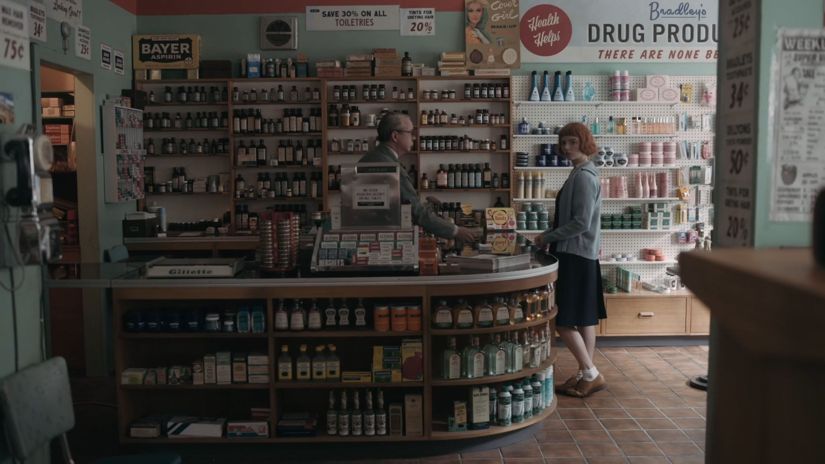
This is the interior of Beth and Alma’s local store called “Bradley’s” and it sells everything from prescription drugs to groceries and magazines to tobacco. This wonderful interior is full of incredible early 1960s packaging and signage which, in this early episode of the series, really helps us feel like we have genuinely stepped into 1963.
-2-
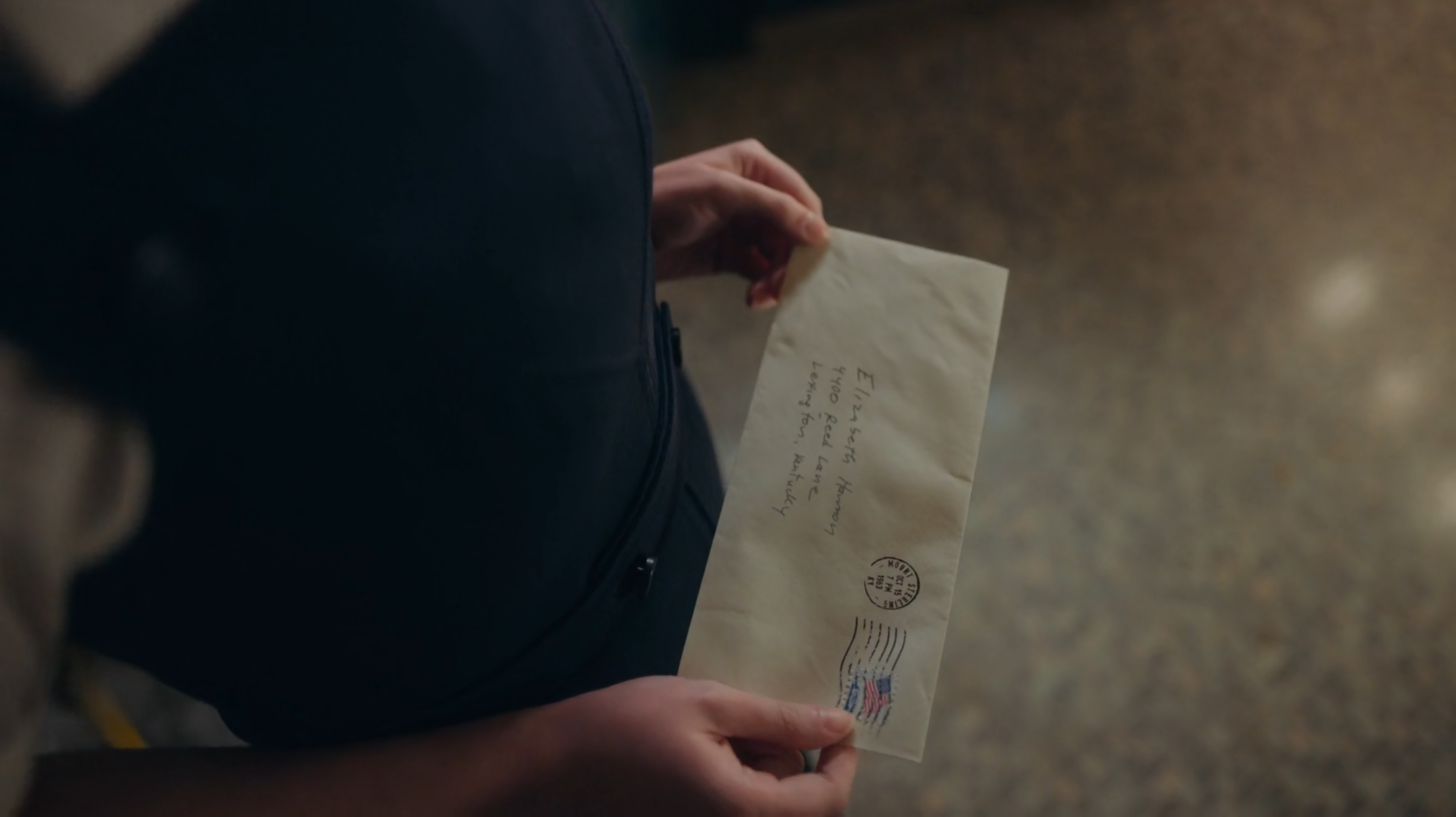
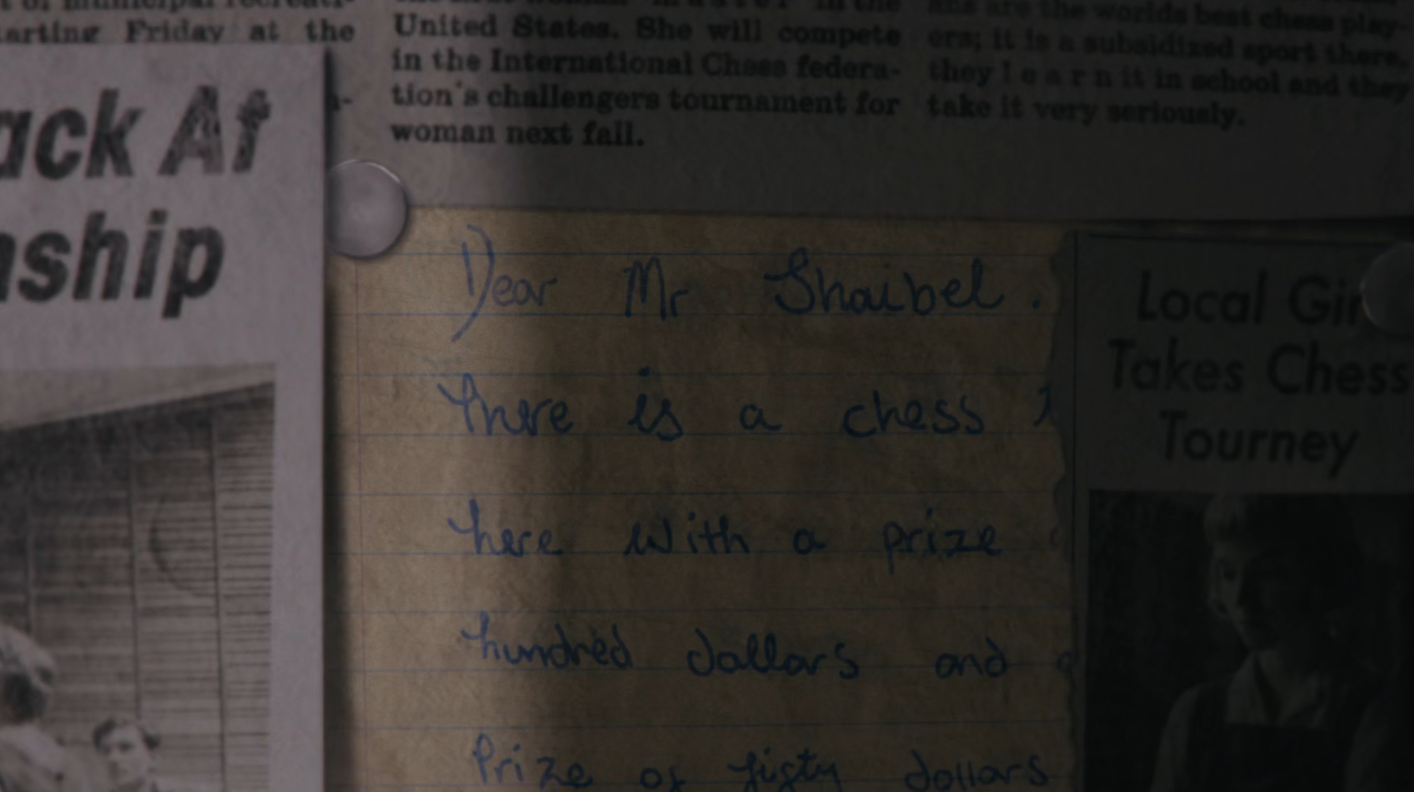
Mr. Shaibel’s letter in response to Beth’s request for $5 so she can enter her first chess tournament is wonderful as both a graphic prop and an emotional beat. Even though Beth hadn’t seen Mr. Shaibel since she was adopted, it shows he still cares about her and believes in her. What’s great here is that we get to see Shaibel’s scrawly handwriting, a classic American envelope and a beautiful date stamp reading, “Oct 15 7PM 1963”.
-3-
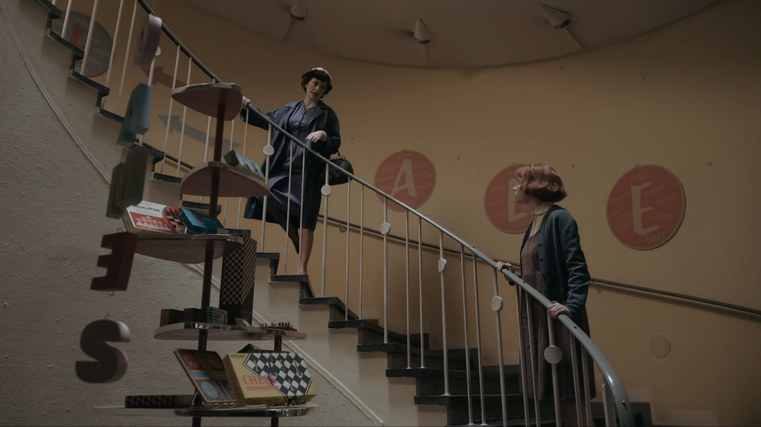
When Alma decides her adopted daughter needs new clothes, she takes her to “Ben Snyder’s” clothes store. The shop is full of signage, but something that really stood out to me was the “SALE” signs leading up the stairs. Personally, I find it quite sickly to look at, but it represents the era so well. The sign-painterly typeface and salmon pink background colour are both really expressive, as well as the meaningless, marketing vocabulary around each of the letters. “Offer, bulk, sale, bargains, remnants, top, best price” are all written around the main letters. I guess not much has changed from the 1960s in terms of advertising, except the colour scheme.
-4-
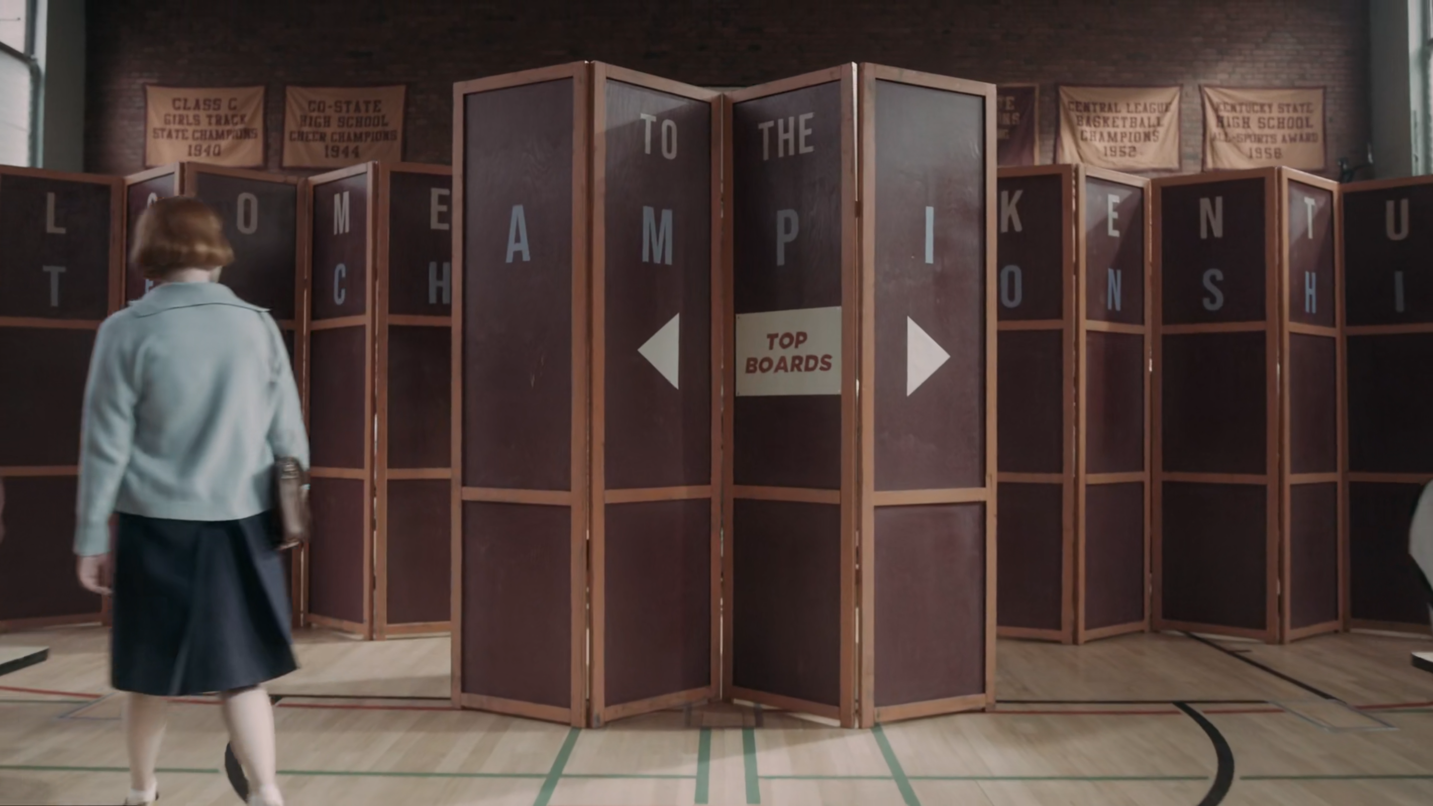
In 1963, from October 20th to 22nd the Kentucky State Championship is held at Henry Clay High School. This is Beth’s first tournament and a wonderful combination of graphic design and set design is used. In the early stages of the tournament, the highest ranked players are hidden by some of the high school’s folding screens. The central screen has a paper sign reading “Top Boards” pinned to it, along with two arrows. The school’s name is also painted in single letters across all the panels. The little pinned sign would have been made by the graphics department and it’s a great example of the kind of cheap thing the school would have produced. The painted letters however, would have also been designed by the graphics department, but then painted on by a specialist set sign painter. These screens play a little part in Beth’s personal journey too, as they create a physical labyrinth which she walks though as the camera pans up. It brilliantly reflects Beth discovering and navigating the mysterious world of chess, which throughout the series is a metaphor for life.
-5-
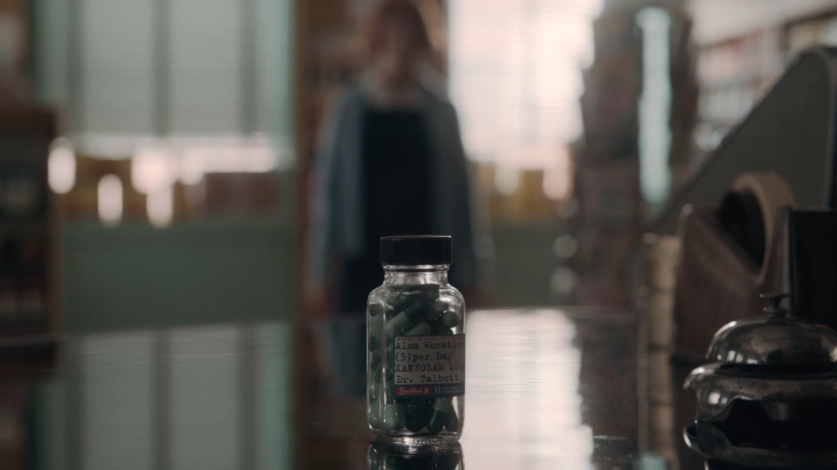
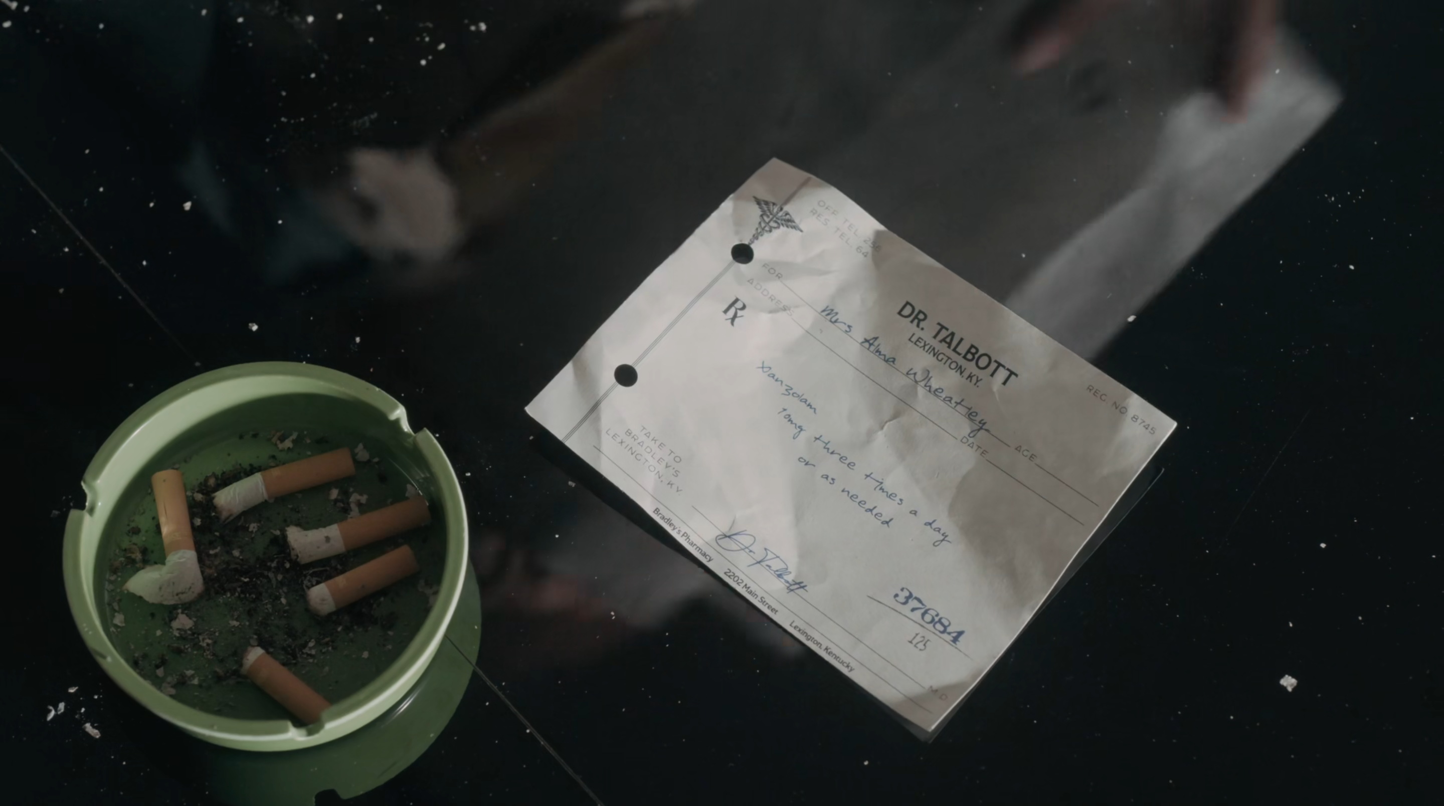
These are Alma Wheatley’s “Xanzolam” pills from Bradley’s store. I love the typed bottle label which I believe was actually done using a real typewriter from a close look and that really adds to the authenticity of a prop like this. Here is also Alma’s prescription from Dr. Talbott with some great handwriting, a number stamp, illustrative detailing on the paper and some hole punches which add to the reality of the piece.
-6-
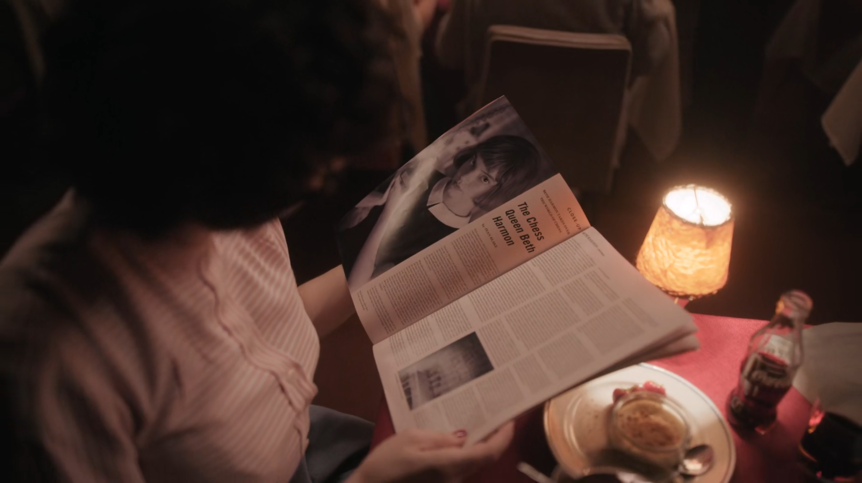
Beth’s interview in the copy of Chess Review, which her mother Alma reads to her is such a simple but well thought out piece of design. Magazine articles in the ‘50s and ‘60s looked just like this, and they still do today to some extent. They would use a simple layout with a tiny point size on the text. The attention payed to this magazine and article, combined with the rosy lighting, gives a warm nostalgic tone that makes you feel you could just reach through the screen to the 1960s and pull it out to read in 2020.
-7-
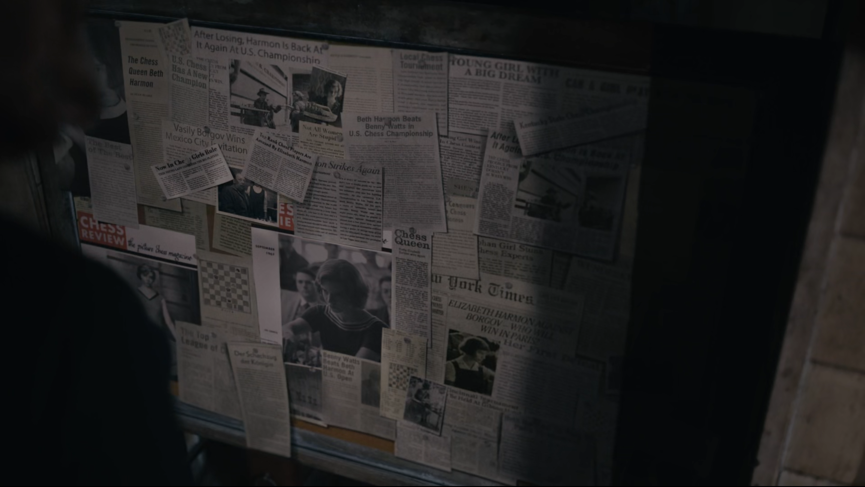
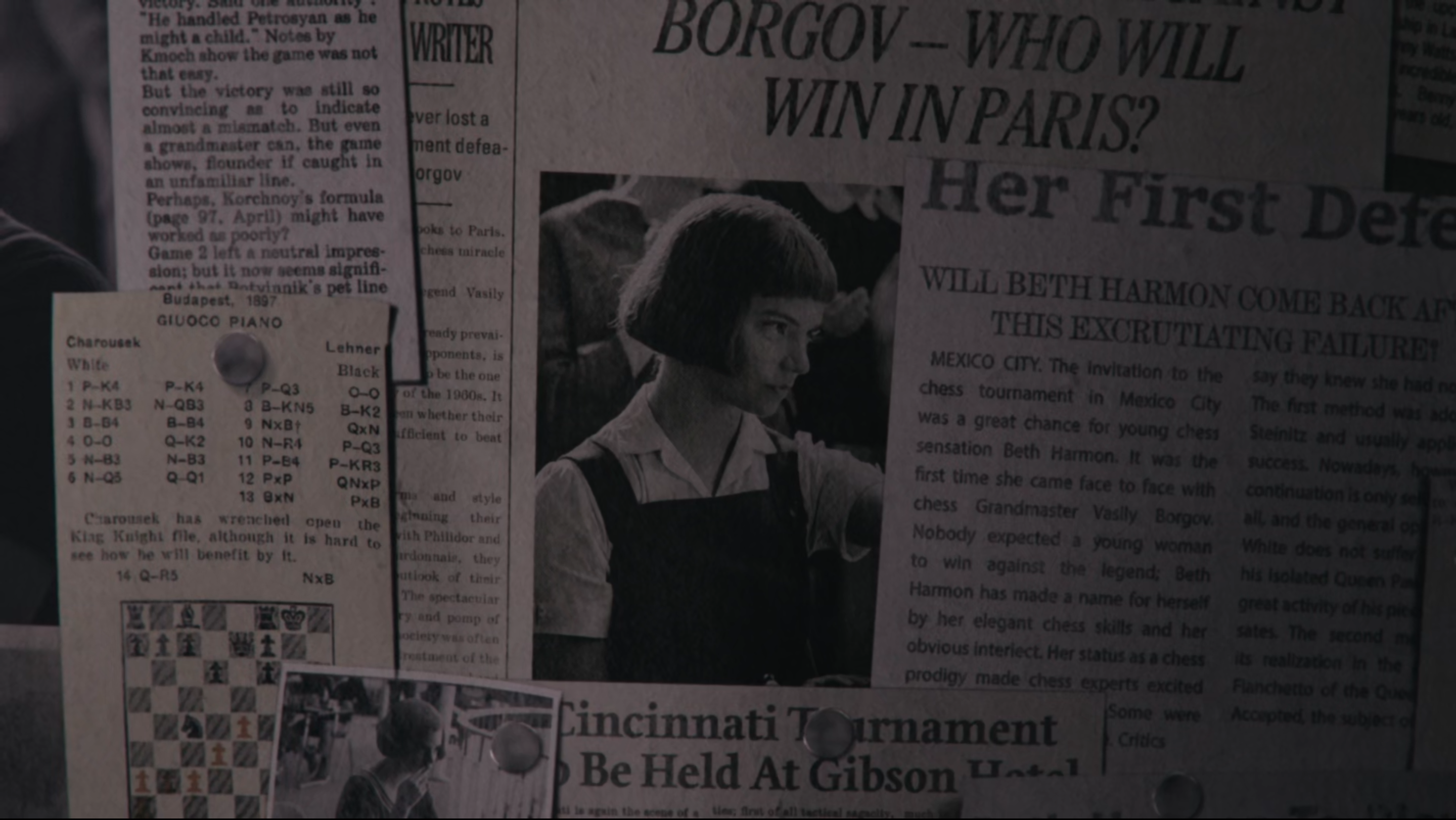
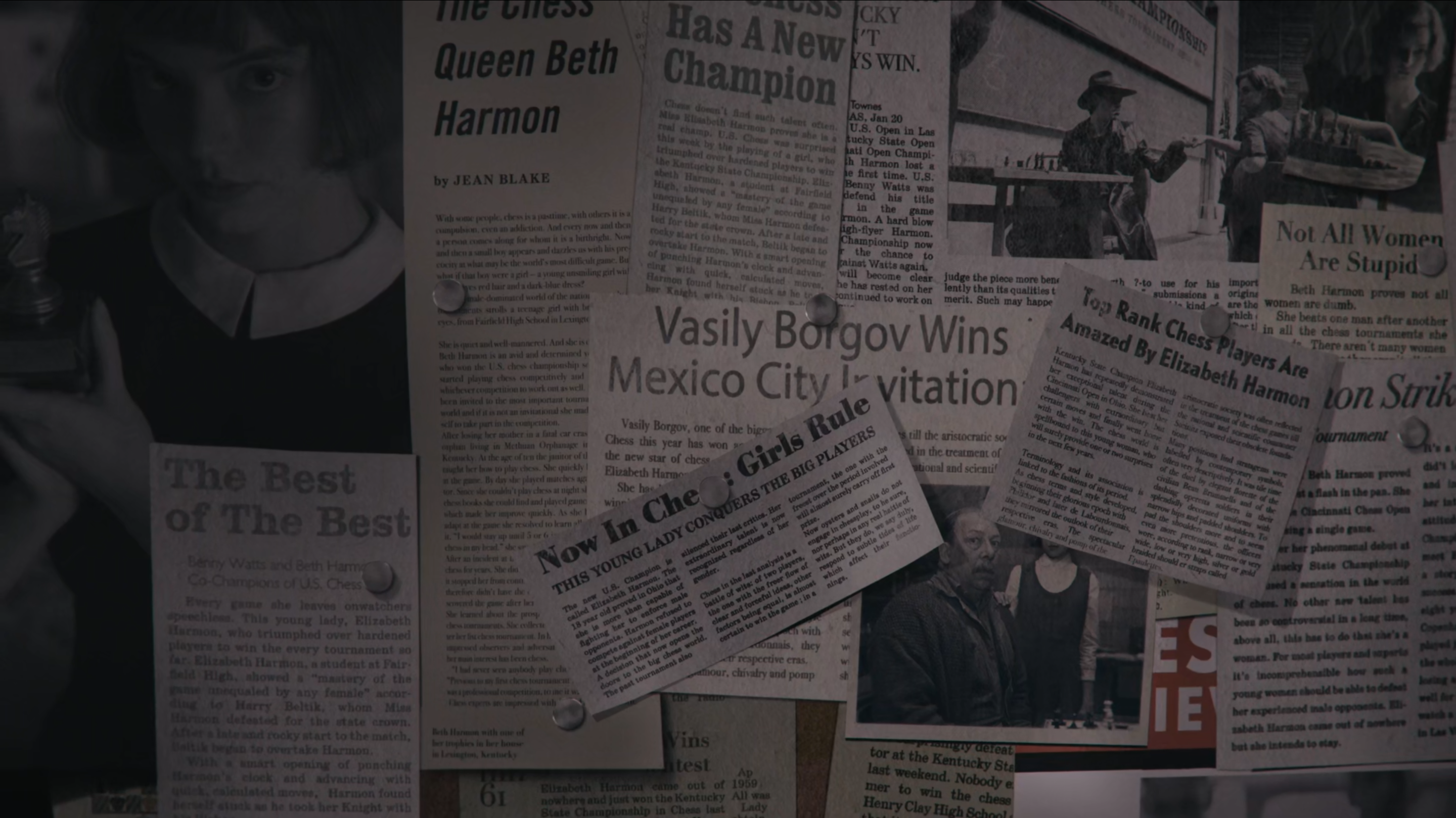
The last piece of design I wish to highlight is Mr. Shaibel’s cork board of cuttings. In the final episode, when Beth returns to her old care home with Jolene to attend Mr. Shaibel’s funeral, she finds that her first chess teacher and friend had been keeping track of her travels and chess success all these years. From her first tournament, right up until his death, Shaibel had pinned up photos and clippings from interviews and opinion pieces about her and she never knew. It’s a magical and gut-wrenching moment as we, like Beth hadn’t given him much thought for a while. We’d been busy caught up in her life, seeing her travel and grow during her hectic career, meanwhile Shaibel had continued to think of her and believe in her all this time. It’s amazing that this is all done with a collection of graphic paper props, showing just how important they are to storytelling. A lot of design work went into these and I’m glad they play such an important role in Beth’s journey. It was also a nice touch that she keeps the only photo of them both as a memento which was taken in episode 1.
If anyone fancies a chat about the series, please leave a comment or check out my social media links. The best place to find me is twitter.com/SamThomasArt and I’d love to hear your thoughts on the show.