I think Die Hard is a wonderful, feel-good, festive film, where only quite a few people die but everyone gets a good, personal story arch. Maybe unsurprisingly, there aren’t a lot of graphic props in the movie. There were only about a dozen different graphic props that were actually designed for the film as far as I can tell. No one is even credited as a graphic designer for the movie on IMDB, meaning the graphic props that are present must have been created by one or all of the following people: Mike Blaze (Assistant Property Master), John L. Jensen (Illustrator), Tommy Tomlinson (Property Master), Michael Denering (Scenic Artist) and Robert Van Dyke (Propmaker Foreman). The few graphic items that do feature though still play significant roles in the movie and today we’re going to take a closer look at 5 of them. Warning! Some of the screenshots do depict realistic looking blood.
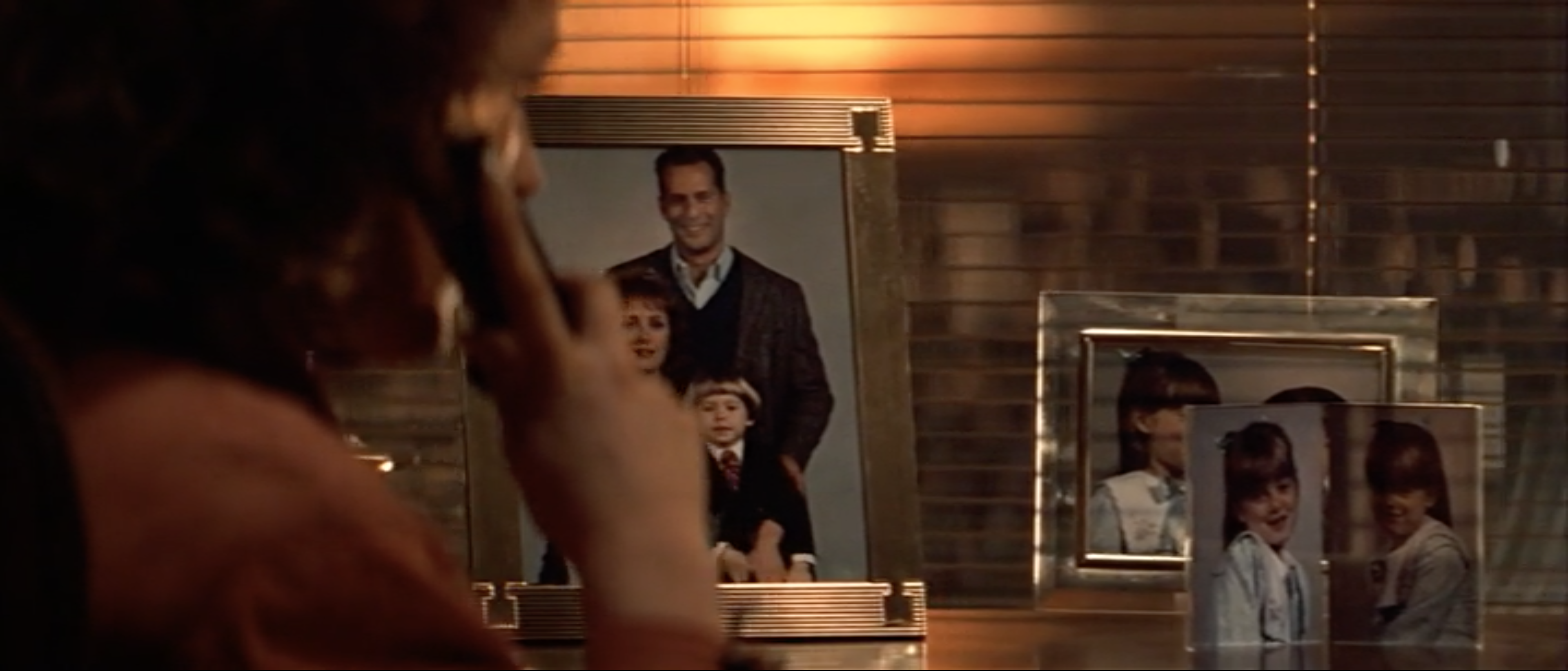
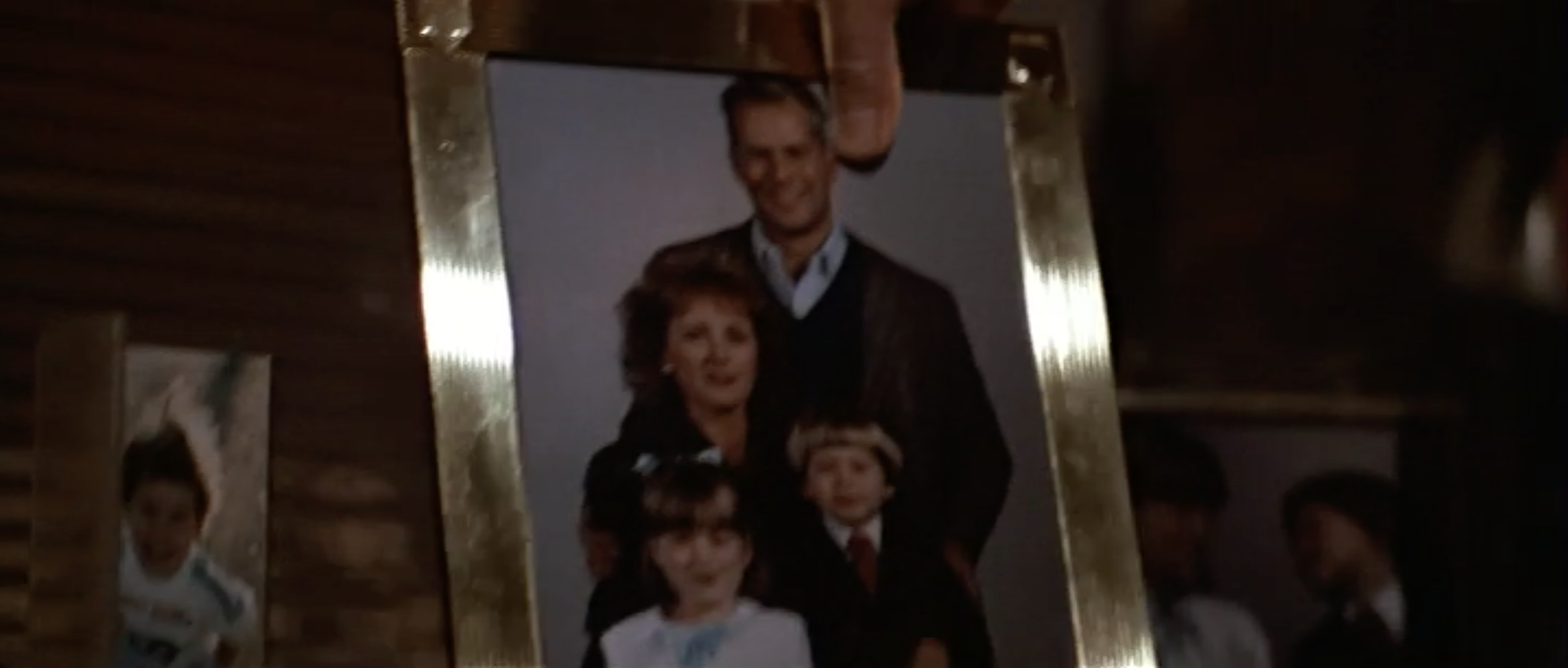
These photos play several important roles in the film, both in plot and hitting emotional beats. The script does mention these photos, “He’s looking away from us, at the picture of the children on her desk” and it would normally be the graphic designer’s job to make these family photos or commission the stills photographer to take them. However, as I stated before, it must have been someone else in the art department who made these for Die Hard.
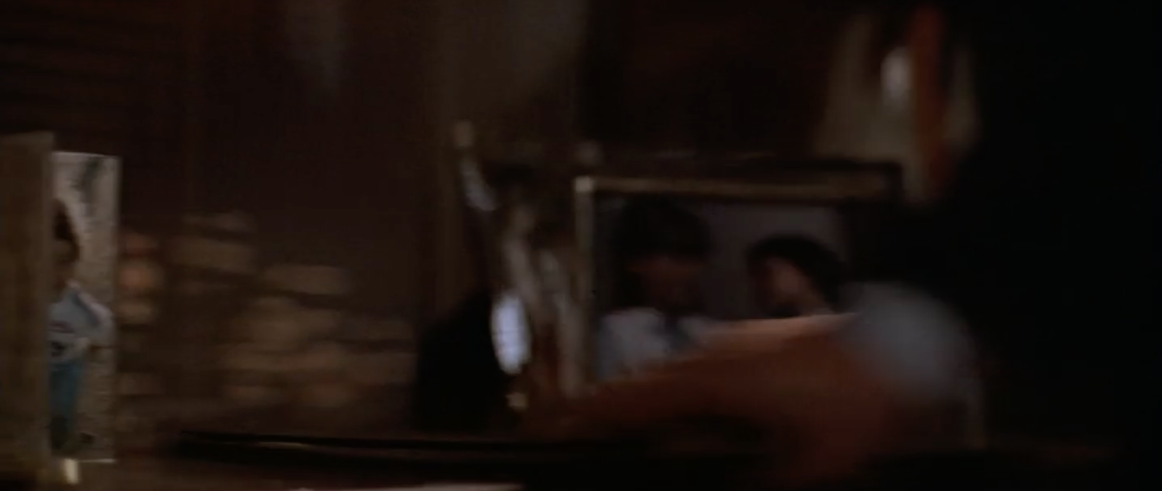
We first see the photos on Holly’s desk at the beginning of the film when she speaks to her daughter on the phone. The slow pan across pics of her children to the main family portrait shows Holly, her children and the man we’ve just seen arrive at the airport. This instantly tells us they are a family using no dialogue. After the conversation, Holly slams the photo face down, hiding her husband from view, showing her frustration and how they are growing emotionally distant.
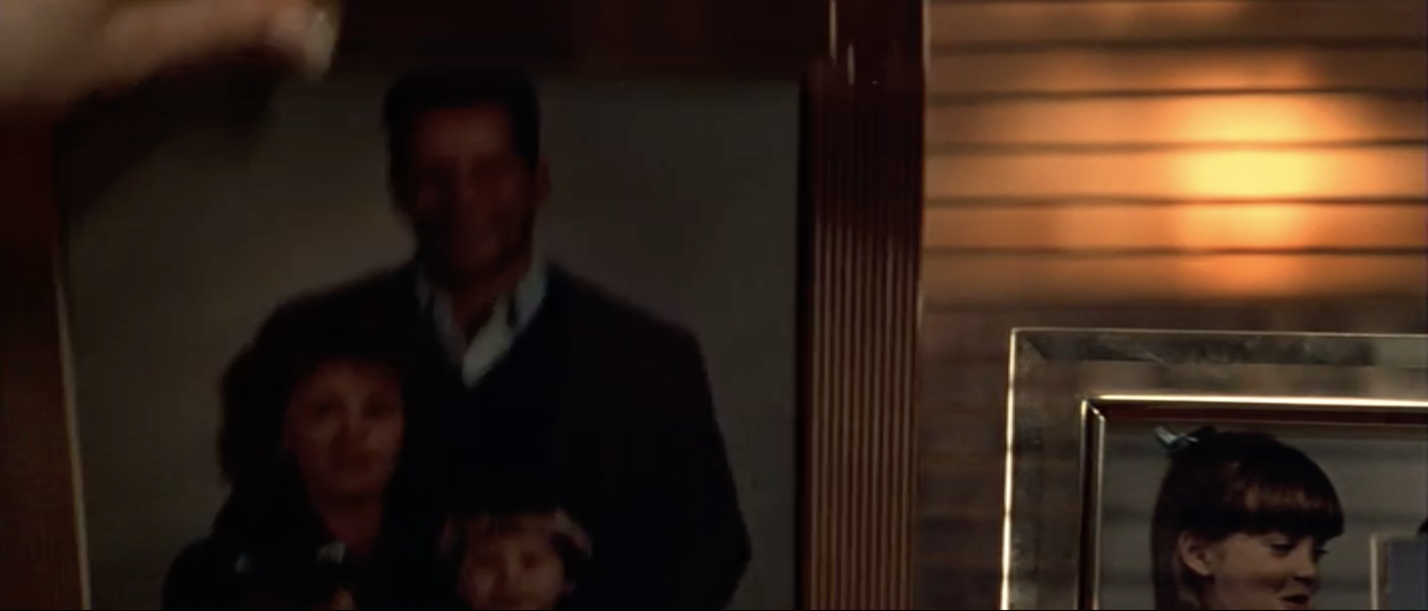
Late in the movie, Hans takes refuge in Holly’s office, using it as a comfy place to keep in contact with John and the police. After Holly and John’s children are interviewed on the TV and Holly shows signs of emotion as they talk, Hans gets suspicious, looks from Holly to the screen and then lifts up the face-down photo from the beginning of the film, revealing Holly and John are married. It’s really powerful how a simple photo graphic prop can have such a significant impact to the tension and plot points of a story.
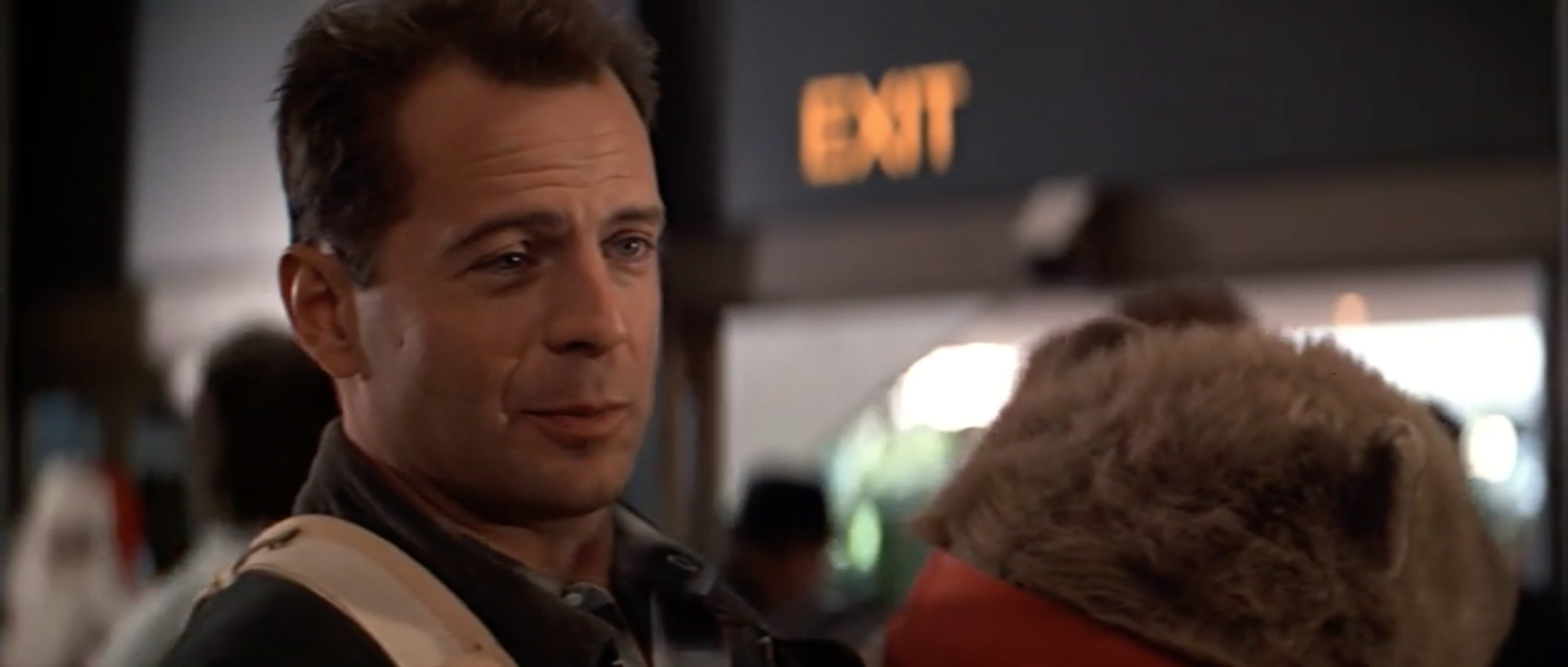
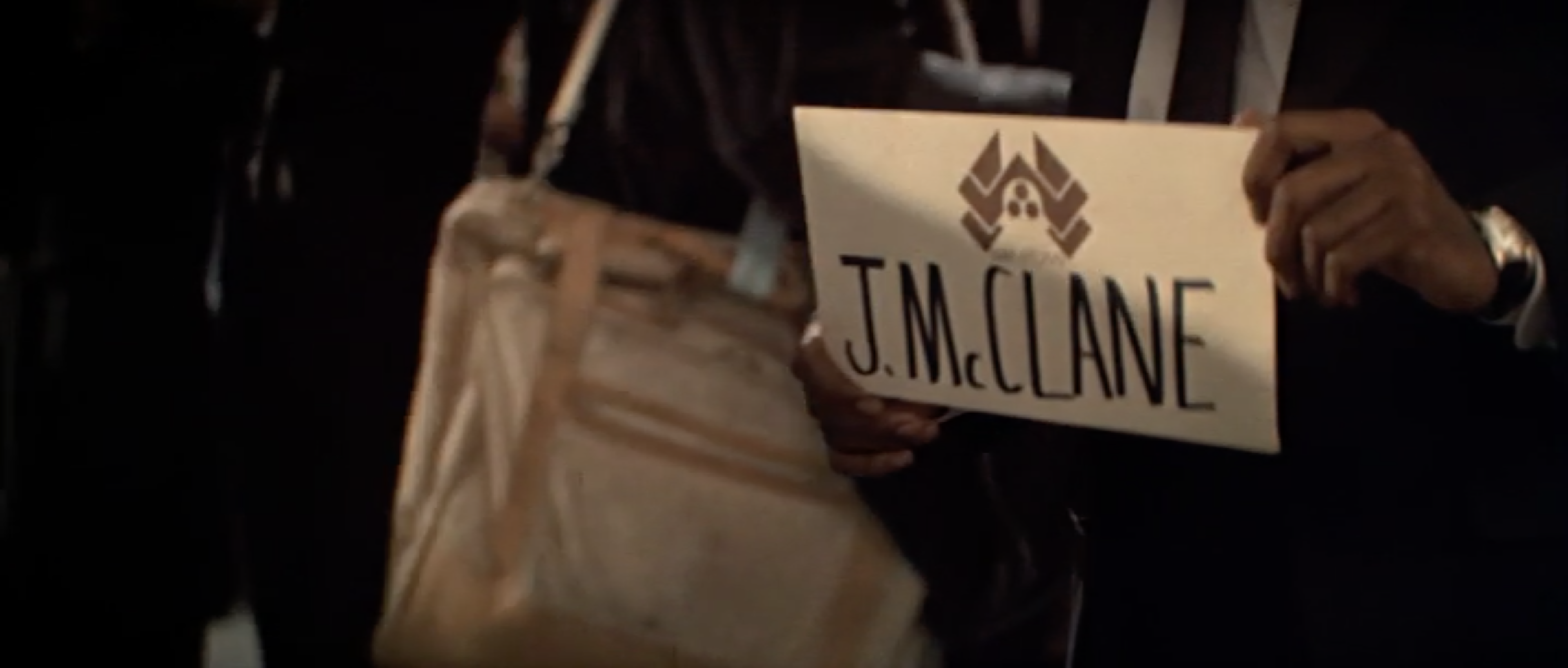
The sign that Argyle holds up at the airport to collect John is a simple piece of graphic design but worthy to mention. It consists of the “Nacatomi Corporation” logo floating above John’s name “J.McClane”. It’s bold, clear and reads well on screen. It tells the audience why John’s looking around, as he’s presumably been told a driver will pick him up. A common sight in an airport, this sign helps enhance the normality of the scene. We presume it’s some middle-aged driver in a bland company car, but then when we finally see the cool, barely-old-enough-to-drive Argyle, who actually drives a limo, it comes as a fun surprise and subverts our expectation.
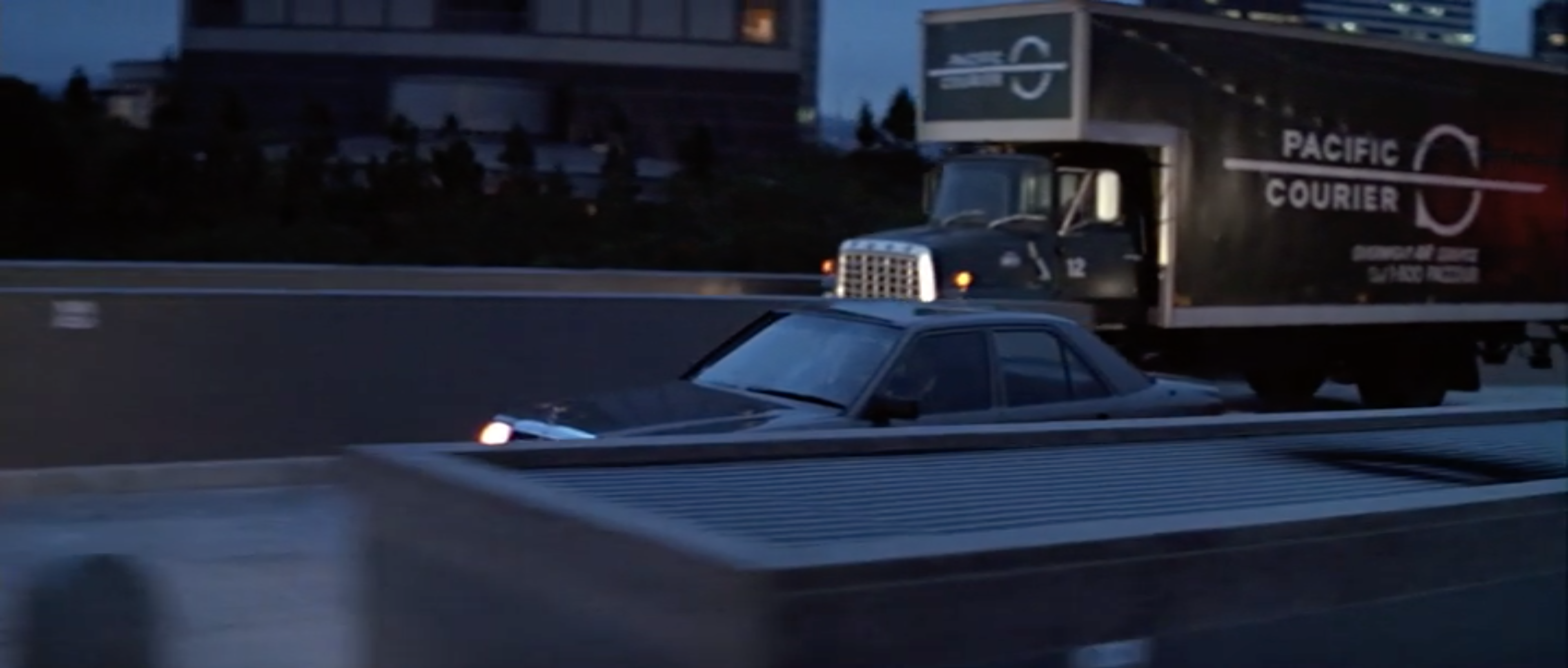
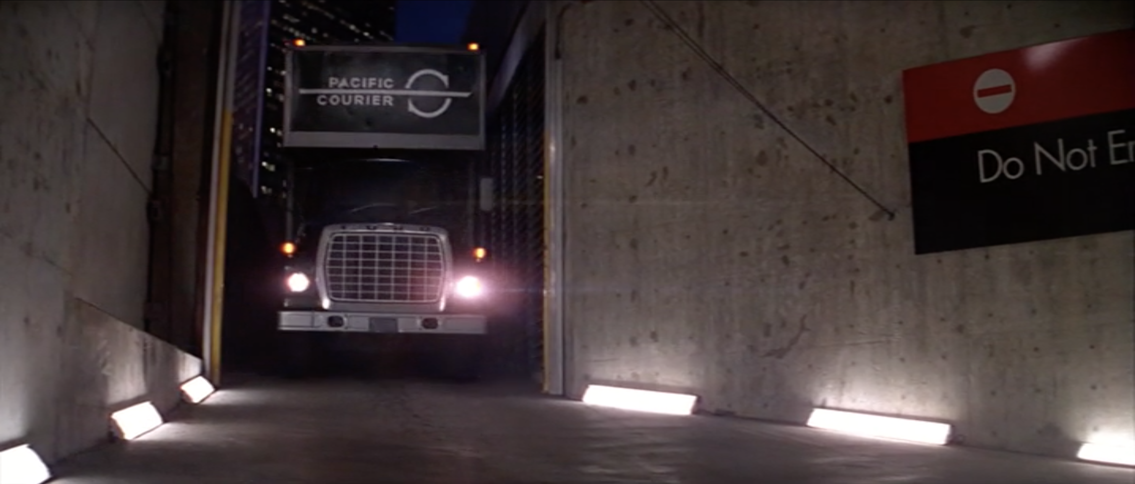
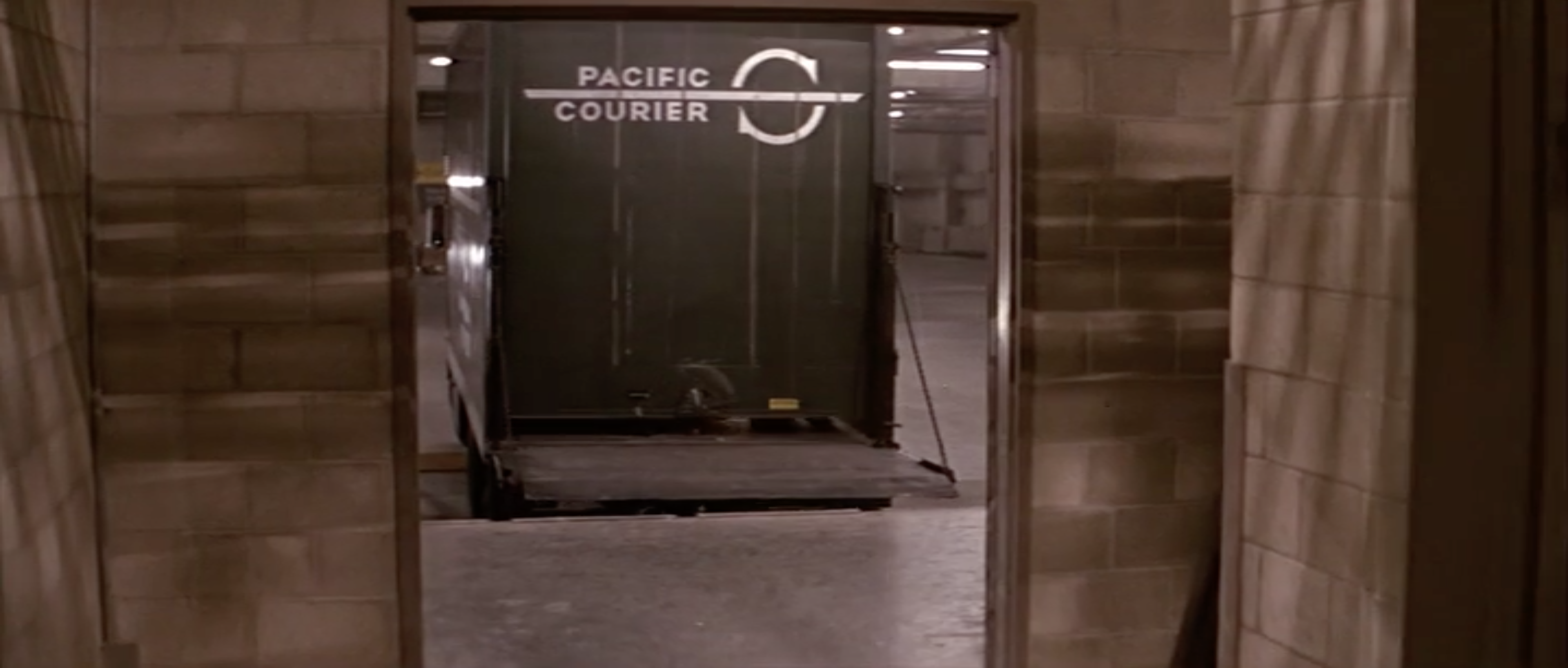
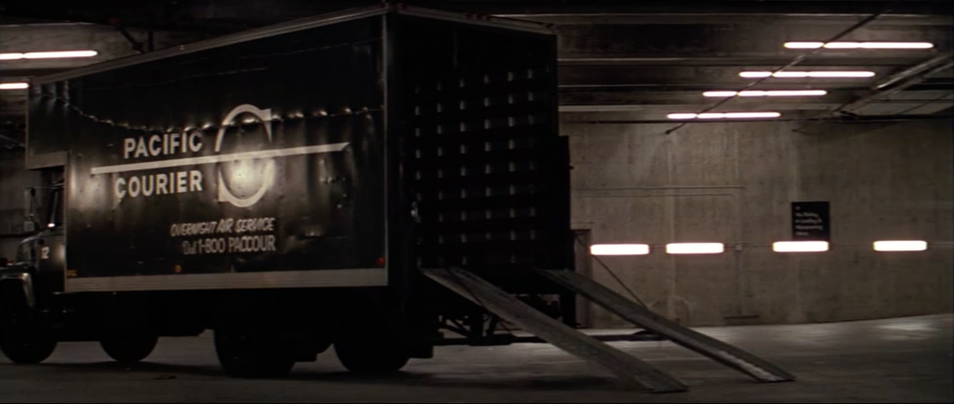
The “Pacific Courier” logo was designed to represent a simple and inconspicuous delivery company which, in the story, Hans presumably commissioned to look legitimate enough that no-one would question it as it drove them to Nakatomi Plaza. The designer who made this logo and signage had to deliberately create something that was dull and bland to blend in with city life.
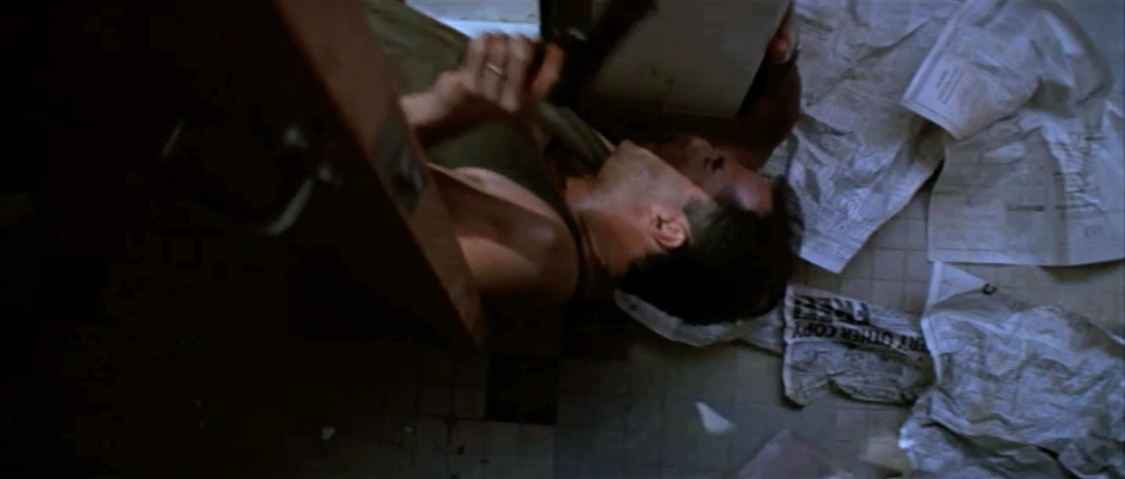
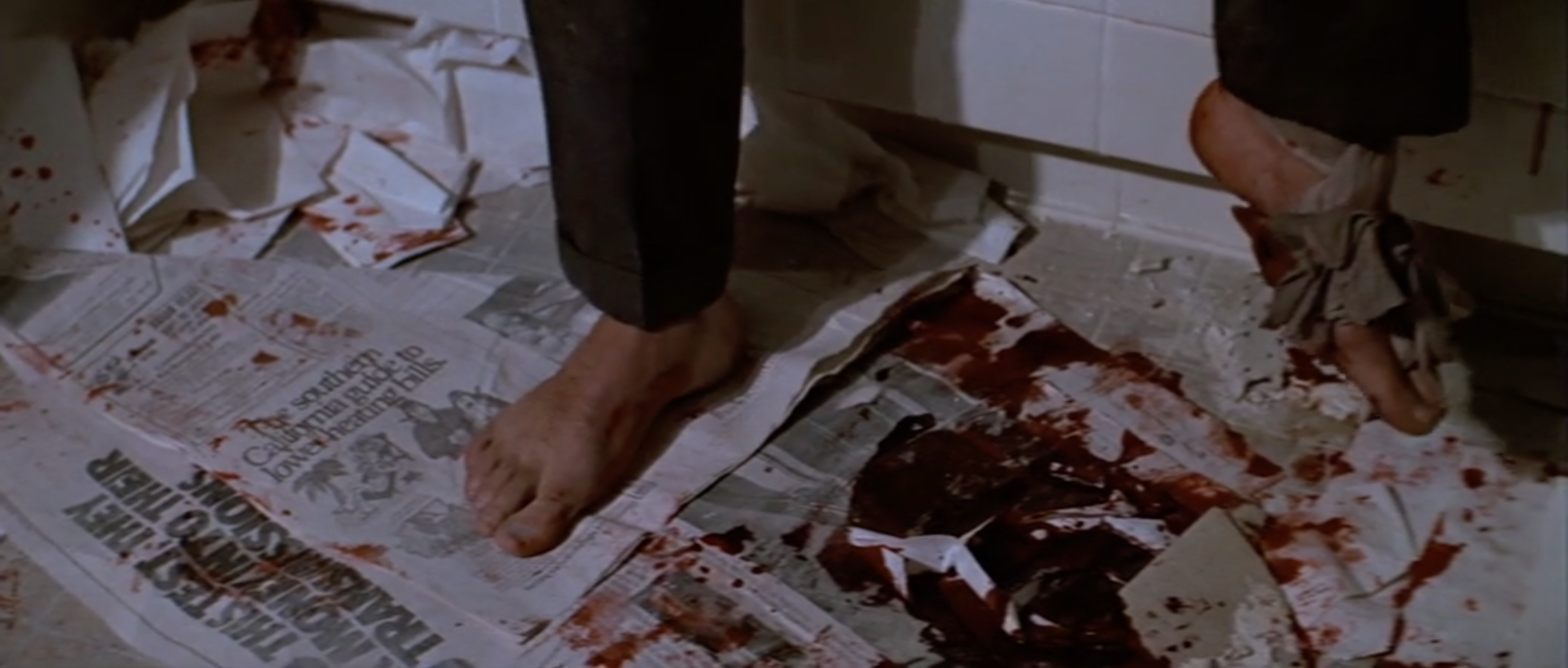
After John escapes from the raining glass in bare feet, he slides his way into a bathroom with lots of newspapers on the floor. These would have taken a long time to write and design and I feel sorry for the creatives who had to see their work mostly obscured with Bruce Willis’ fake blood. There’s a large advert which says “Every other copy FREE!” and one headline that reads, “The southern California guide to lower heating bills”. Not overly exciting contents but I’d love to find out what the other headlines and articles consisted of one day.
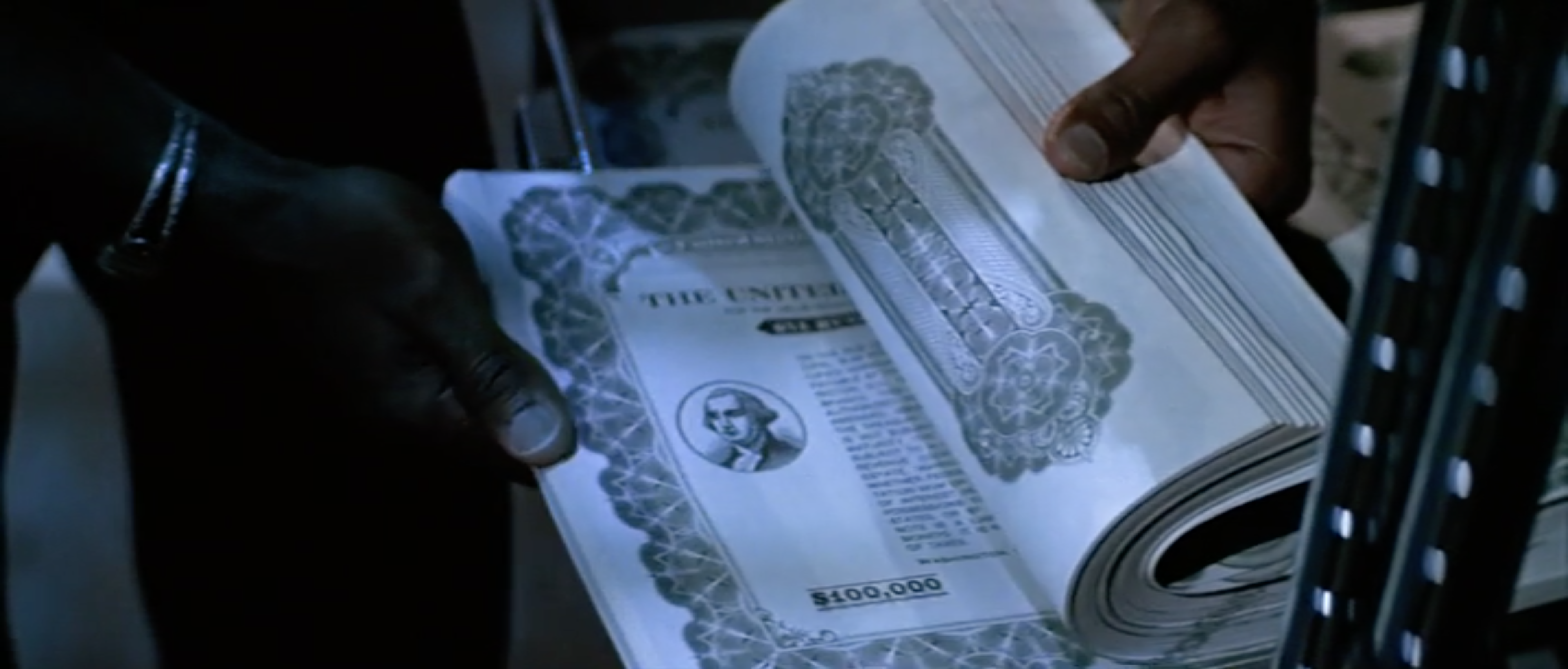
When it comes to fake money, like the $100,000 bonds used in Die Hard, you want them to look as realistic as possible, but you can’t use the real imagery from original as this isn’t just copyright infringement, it’s against the law and classed as forgery. When designing money and official government documents for TV and film, you have to create an interpretation of the item you’re faking, making it look realistic but with your own uniquely designed imagery. Although the many $100,000 bonds that were used in Die Hard were the same, it would have taken a long time to design them just right, to look as realistic as possible but without breaking the law.