This album cover is from the second album by dodie. Dodie Clark is a singer-songwriter and musician from South East England who began her career on Youtube in 2011, posting original songs and covers. I started following her in 2014 and in November 2016 she released her first album “Intertwined”. Then in August 2017 she released this, her second album, “You”. In January 2019 dodie realised her third and most recent album “Human”. These can all be heard on her Youtube channel or bought on CD and vinyl. dodie is one of my favourite artists as her soft tone and turn of phrase are very warming to listen to and her songs are often emotional, sometimes sorrowful but always meaningful. dodie strikes a fine balance between emotional ballads and straight up bops. I’ve heard dodie live in concert 3 times, which is more than I’ve heard anyone live come to think of it, and I even met her in mid-2017 (and give her one of my charcoal drawings).
The designer of this cover art is Sydney Emery who started out a “Freelance Creative” and about the time he designed this album cover he began working as designer at the music company Vevo. By may 2018, he became Vevo’s “Head of Design in Europe” and as of January 2019, Emery was made the overall “Head of Design” at Vevo and he now lives in New York.
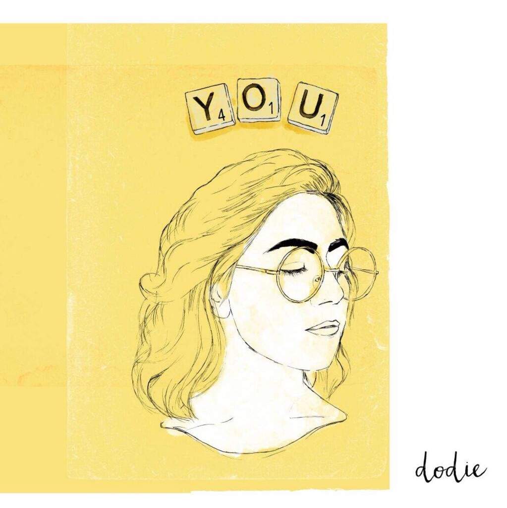
The design of this album cover stood out to me for several reasons when I first saw it. The soft, hand-painted style feels warn, friendly and personal, as if we’re being invited into dodie’s private life. The unpainted hair implies this will be a raw album about one person’s deep feelings, not generic pop album for the masses. The closed eyes give a sense of thought and calm contemplation to represent the tone of the songs inside. The title is cleverly written out using scrabble tiles. I believe this reflects dodie’s mind trying to find the words to express what she feels. I also think it represents childhood family games, connoting love and safety. Lastly, cleverly giving the tiles values that add up to 6 is a cute bit of fan servicing to represent the song “6/10” which is track 2 on the album.
The yellow background reflects dodie’s signature colour ‘dodie yellow’ which is a warm, sunflower tone and complements the white side-bar very well which has dodie’s name at the bottom of it in the lower right-hand corner. Her signature, which has appeared on all 3 album covers now and is used on her promo material too, is a wonderful brushed typeface called “Frolicky”. Fun fact, it was actually the first ever typeface I bought a licence for.
This album cover is a great piece of illustration, the design is really well considered and it reflects the music brilliantly. Both Emery and dodie should be very proud of the message the album cover gives and I think they probably are.