HUB Magazine is the official University of the West of England (UWE) student magazine. I had already been Head Designer of HUB for 2 years before this rename and rebrand in 2019. Having now graduated my 3rd and final year at UWE, I’ve now handed my role as head designer on and can’t wait to see how the next generation of students carry on the publication’s legacy.
Before 2019, the magazine was named HUB Voice, which made little sense to begin with and the logo wasn’t at all representative of our modern magazine. The logo consisted of a blue polygon with the magazine name in a horrid, sans-serif typeface with an oversized letter “H” italicised for some reason. Many of us on the committee had wanted a rebrand for a while, and a new name. After some committee voting, it was declared we would now be HUB Magazine, a clear, simple and descriptive name. We kept the HUB part as we were linked closely with another UWE society called HUB Radio and this made sense.
As Head Designer, I got the job of visually rebranding, and as I already had a good understanding of our magazine’s values and message I went straight into designing a logo. I started designing in black and white, exploring fun and expressive logo ideas using a range of typefaces. I showed these initial ideas to the rest of the committee but everyone liked different elements of each. I suggested using the 1960s style blocky typeface from the logo idea with “Magazine” running down the edge of the letter B in “HUB” and they agreed.
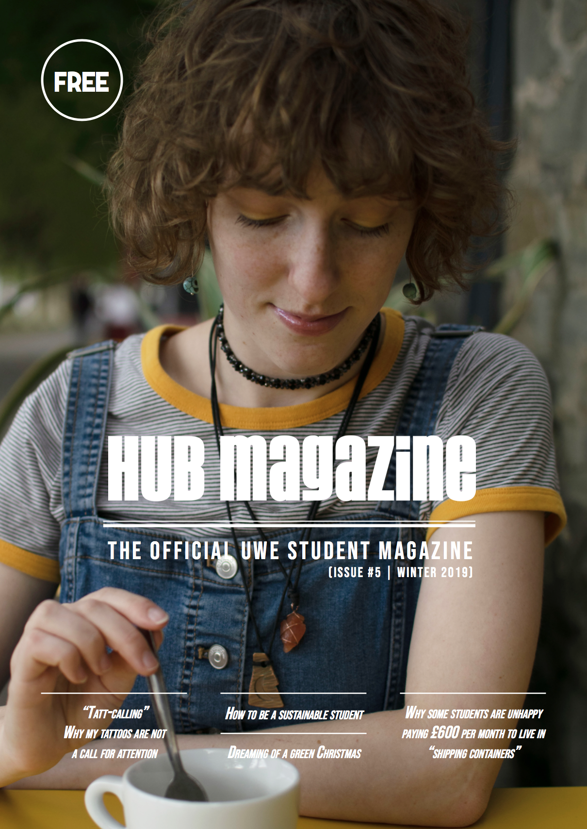
When developing the logo, I’d used a mixture of upper and lowercase letters from the typeface. I kept it mostly uppercase but made the “i” and “g” lower, and the mix of cases made the lettering look more retro as at this point I’d decided on a vintage, 1960s style design. Everyone agreed it was bold, versatile and friendly so I took it and developed some more. After a few tweaks and adding a clean border, I felt I had a strong banner as the text looked pretty good by itself. The name alone quickly became the header / title we’ve used on the cover of all the following magazines since.
We still needed an icon logo, either square or circular and so came up with a simple solution. I wrote “HUB” and made it a large feature at the top of the logo and placed the word “magazine” below it. I made both words flush with each other down the sides and then encased it in a variety of coloured borders, mimicking a faded 1960’s colour pallet. I gave the outer shapes a large border, coloured the same as the text to make the name pop out more and this worked well. These got a lot of support from the committee and the decision was, the orange text and border, with the cream background would be our new logo. Our branding colours would then became orange too and most people preferred the round designs over the square as this felt more friendly and better fit the modern icon shapes online.
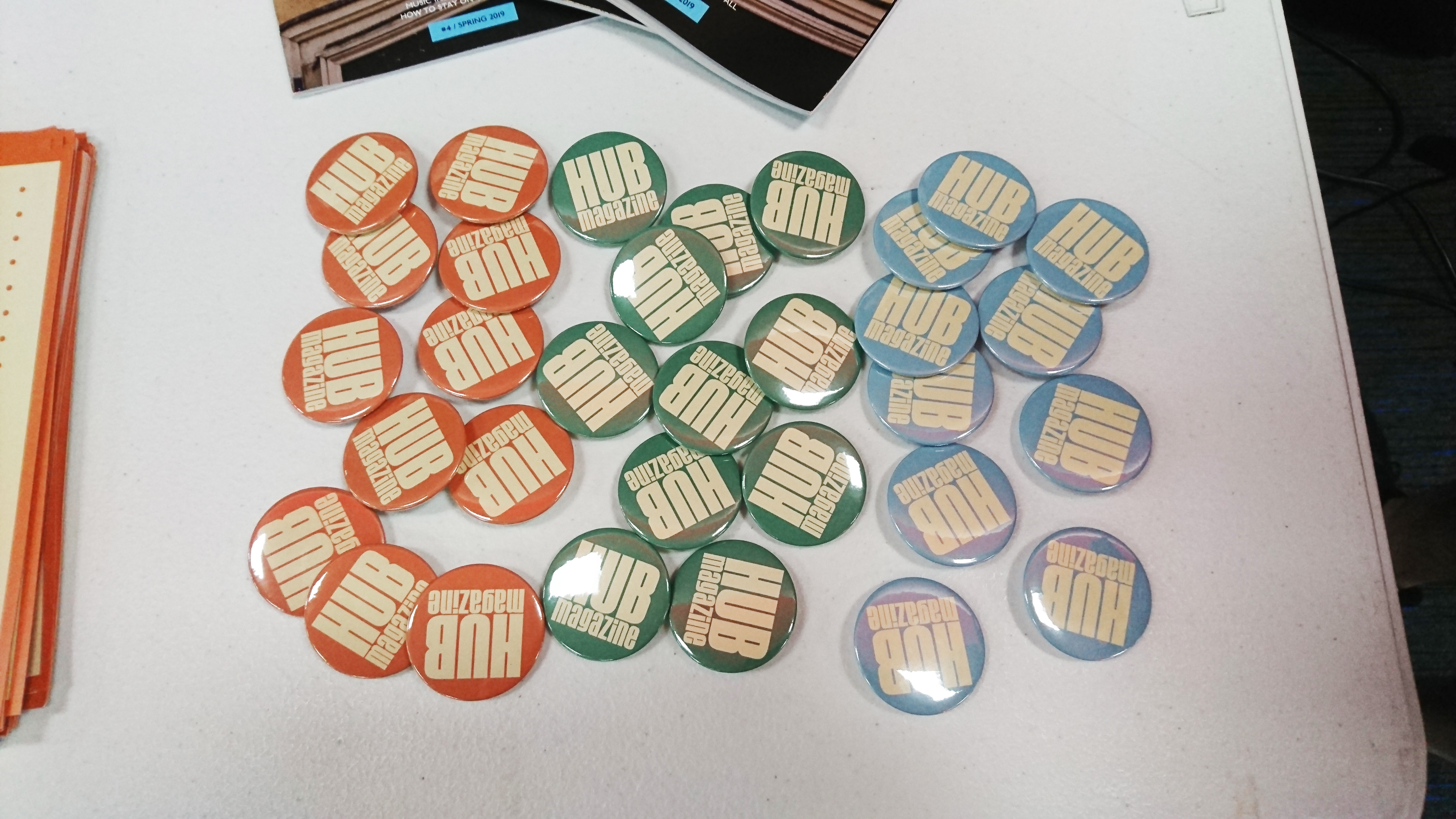
The other 2 colours weren’t discarded however, as for the following fresher’s fair, we made coloured badges using the 3 different tones from the earlier logo designs: orange, blue and green. To anyone who signed up to our society on the day got to have a badge and the choice of colours went down really well. I also designed our first official poster and flyer for the fair, but that’s a story for another time. I’m really proud with our new branding and I’m glad I had the opportunity to design it.
Here’s the link to the HUB Magazine logo page on my website: