Design Process Of: The Flying Chairs Theatre Company Logo
DESIGN PROCESS OF: THE FLYING CHAIRS THEATRE COMPANY LOGO
Over a year ago now, one of my university flatmates, who studied Drama, started up an Amateur Theatre group with 11 friends from his course. They wanted to start their professional careers before university had finished. They decided on an opening production and during early rehearsals, my flatmate, in a scene where his character was supposed to be furious, flailed a bit too hard and accidently kicked a chair, causing it fly across the room. And thus, the “Flying Chairs Theatre Company” was born. Soon however, they realised they needed some branding, and when someone suggested a logo should be designed, my friend came home that night and asked if I would take on the job. I happily accepted.
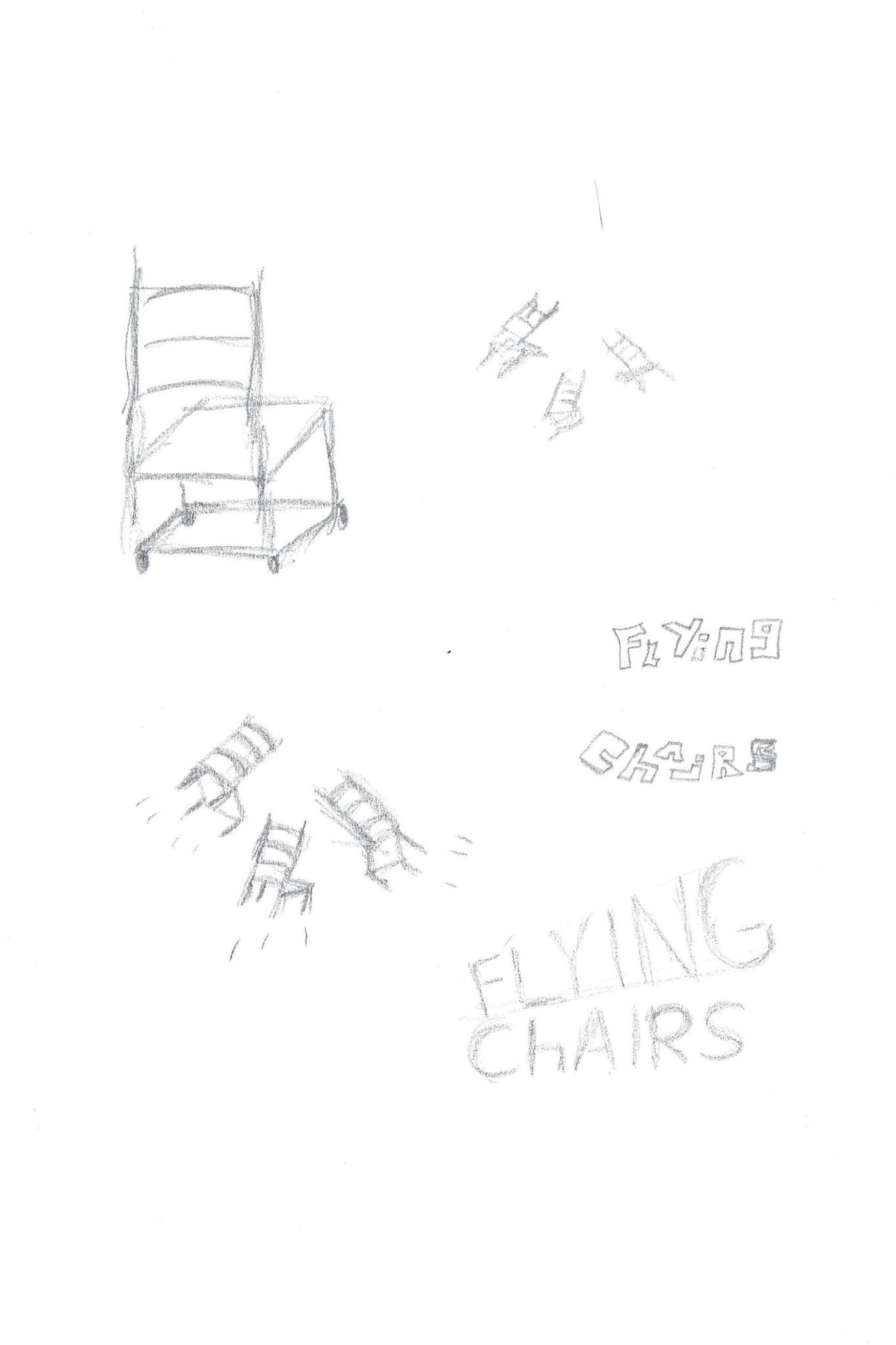
I wanted to reflected the group’s fun and creativity but also professionality in the logo. I began by taking their company name Flying Chairs literally, as it evokes such fun and brings an expressive image to mind. I did some research to find some examples of logos that I thought represented the vibe my friend was after, then went online and simply searched “chairs” for some more inspiration. Later, I drew some designs of 3D chairs in my sketchbook to really consolidate in my head what chairs looked like at different angles. I wanted to make a simple 2D chair look as 3D as I could with as little detail.
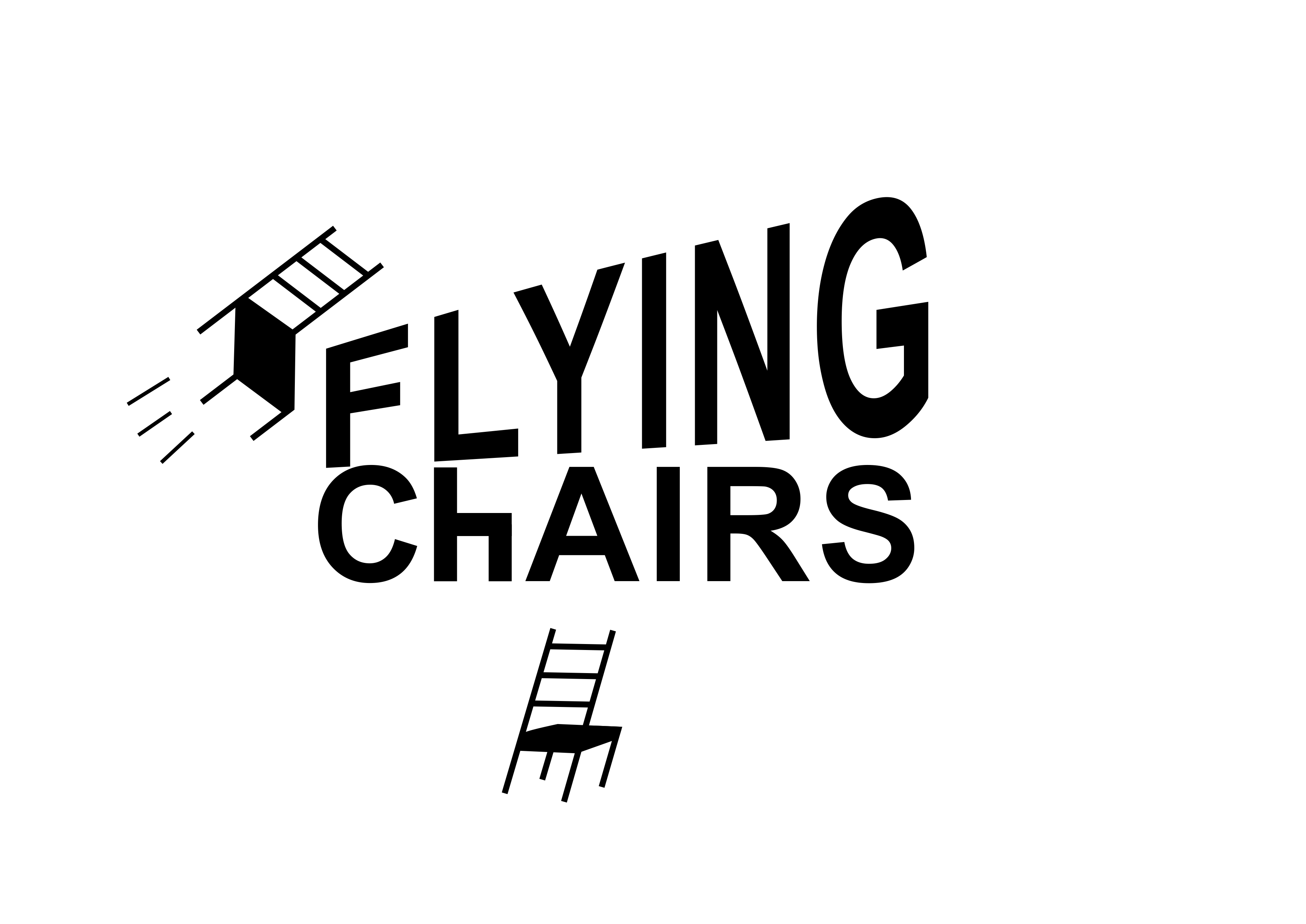
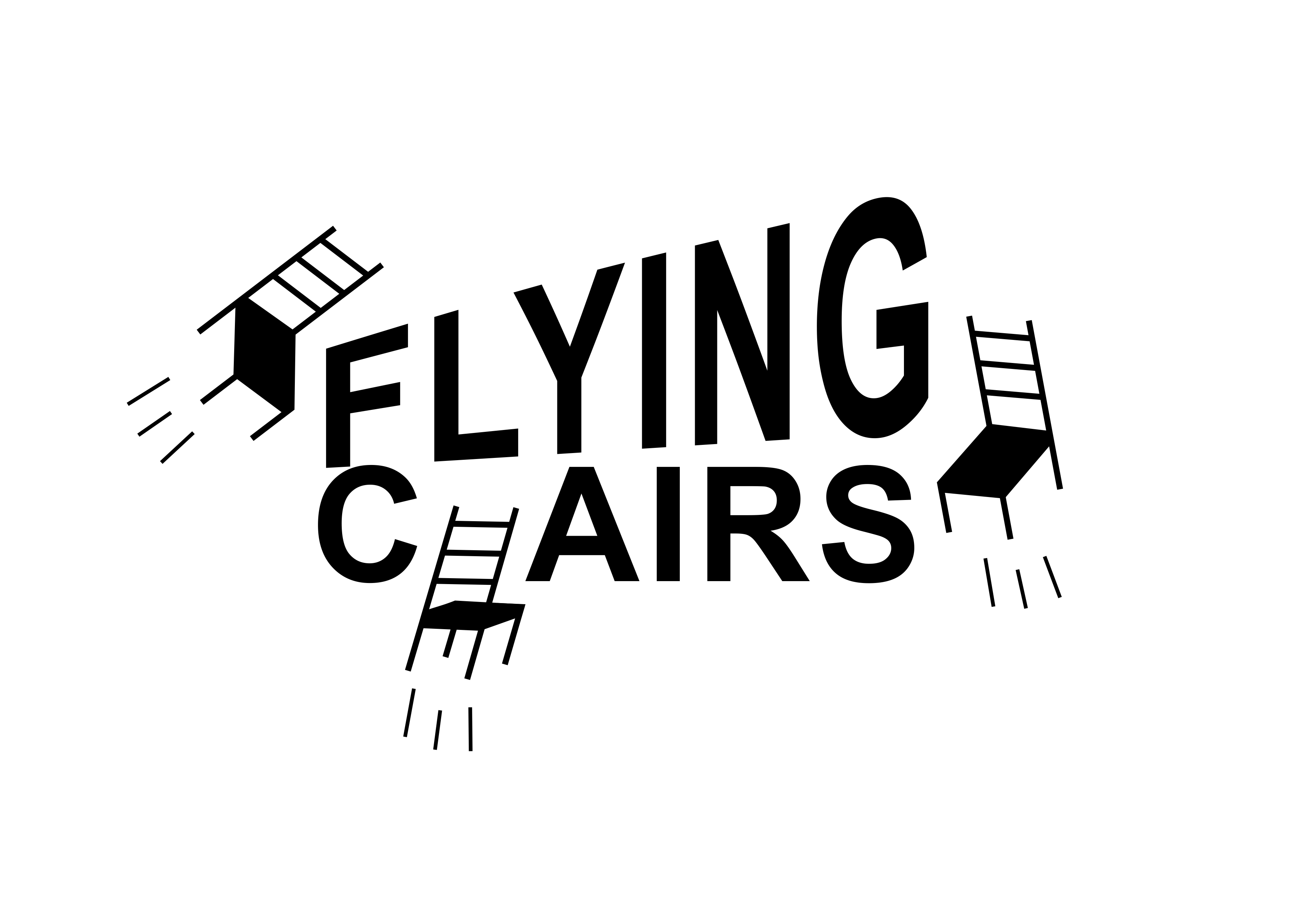
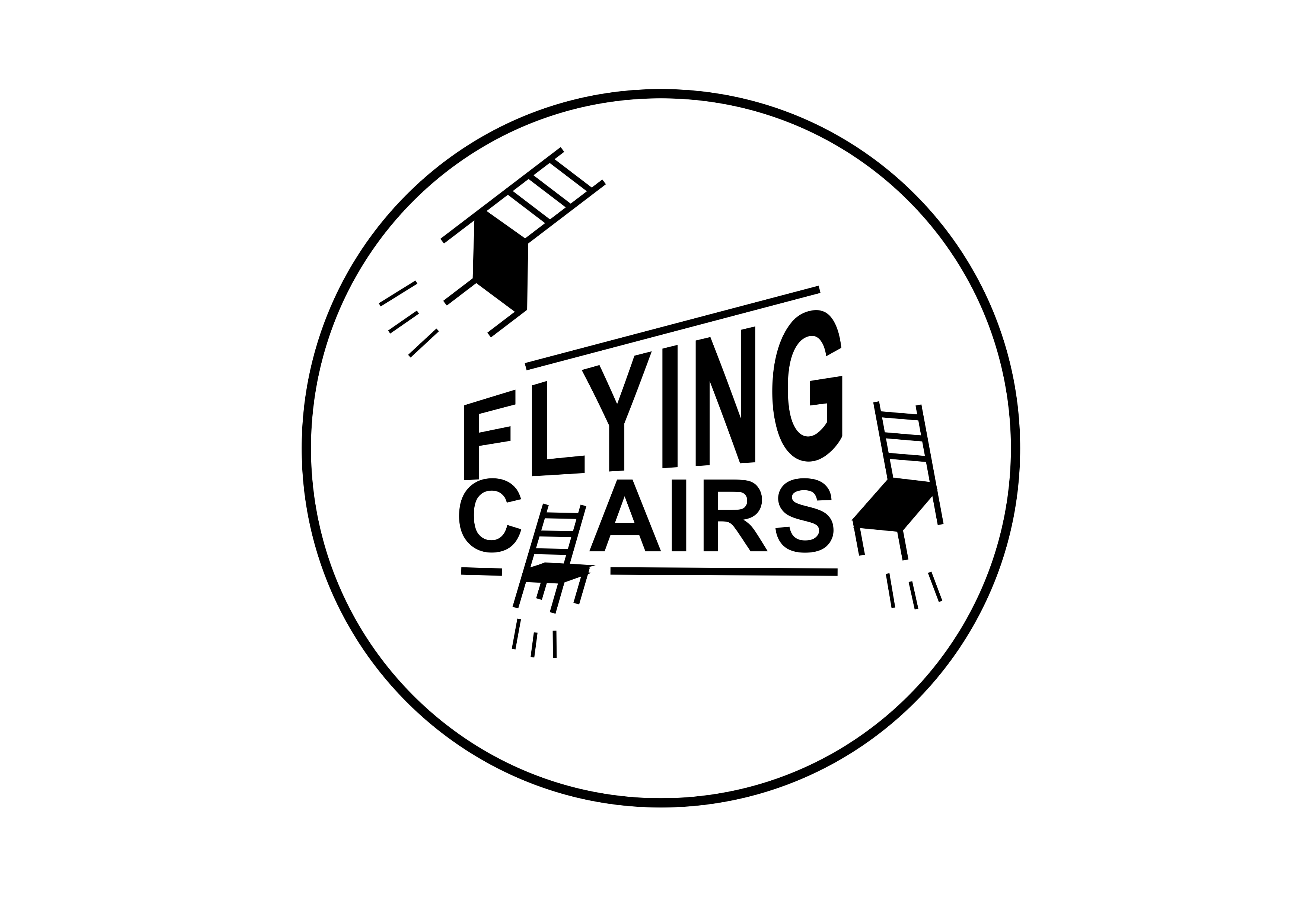
When I was happy with my sketches, I went digital. I typed out the word “flying”, angled it upwards, making the word grow larger towards the letter “g”. This was supposed to be an initial idea, but it fitted the purpose so well I kept it. I found it demonstrated in motion, the forward thinking attitude this theatre company was striving for.
I then typed “chairs” beneath my “flying” text and I also left this very simple and clean, in uppercase, using the typeface Arial. Arial isn’t usually an elegant typeface for design, but in this context, it worked. I kept “chairs” an equal height across and instead of an “h”, I drew a 2D profile of a chair. Then, using my sketches I drew some 3D looking chairs around the text, flying in from different angles and moving pointing towards the clean company name. This initial mock-up unexpectedly became close to the finished logo design.
My design evolved over a day or two and I chose to get rid of the letter “h” chair, as I realised it looked crude and childish next to the crisp text. I replaced it with a third and final chair, which when designing, I angled to look like a letter “h”, forming the word “chairs”. I felt this worked much better and I also drew movement lines beneath each chair to finish them off. I’d done these on my initial sketches but left them to last as I didn’t know if they’d work, but they really did.
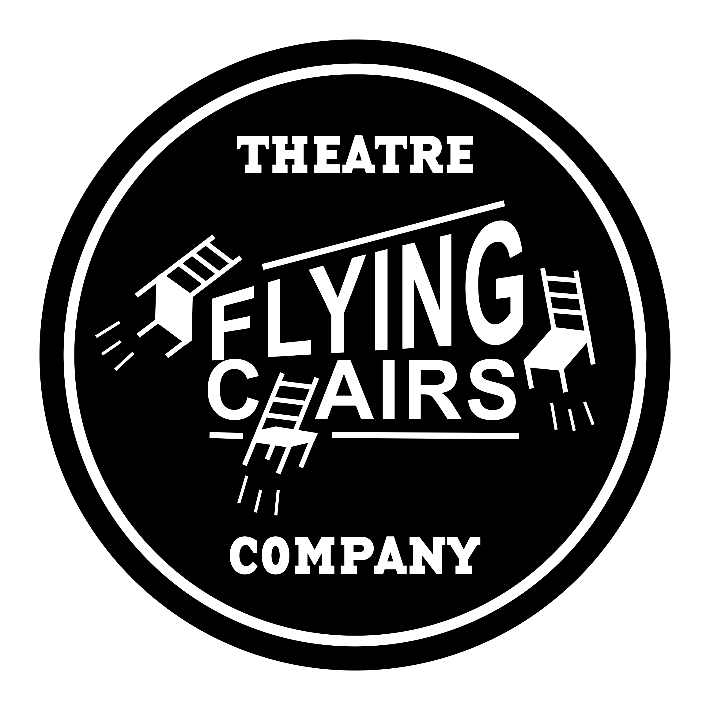
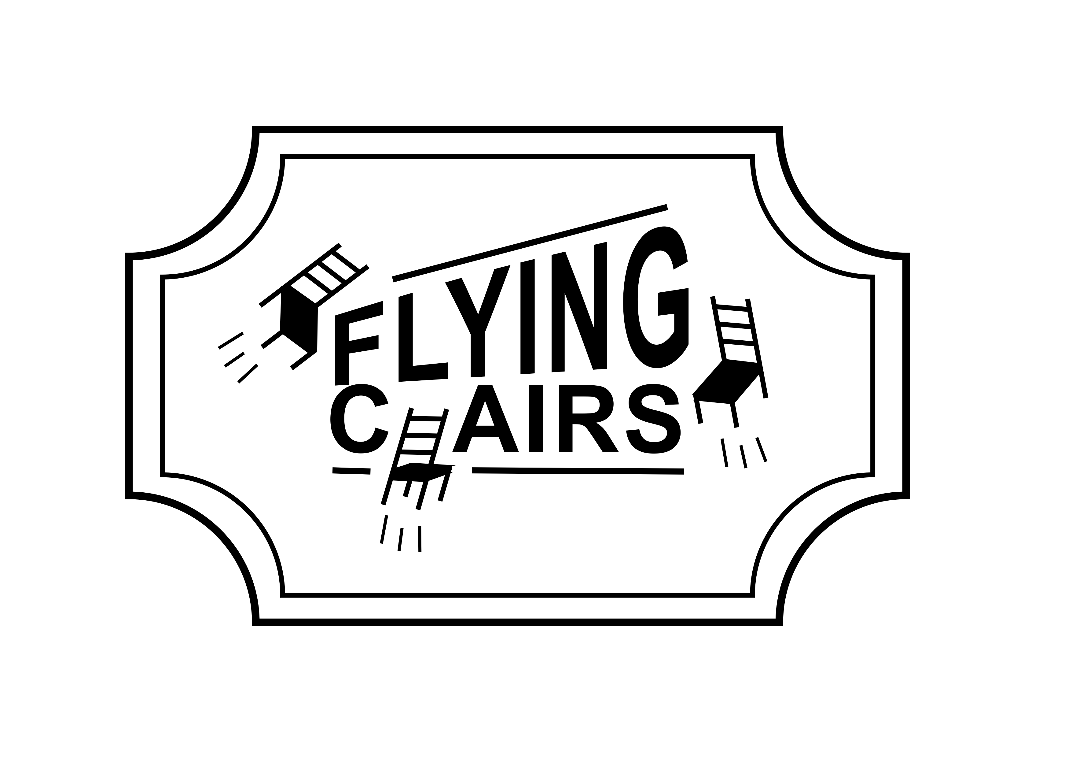
I added two heavy weight lines, one above and one below the company name to frame and ground it. I removed sections of the line where it overlapped the chairs. It gave a more dynamic feel to the logo, having elements interacting with each other, making one cohesive image.
This all looked great as a central image, but I felt it needed encasing, so I experimented with double rectangle borders, inverted corners and circles. I liked the circular outer design most and when shown to the Flying Chairs Theatre Company, they did too! Leaving out sharp, outer edges, made the logo friendlier and inviting. This is probably the reason most social media icon displays are now circular.
I also felt it needed the text “Theatre Company” on the logo, so keeping with the simple theme, I added it above and below the main text and artwork. But this time I used a typeface called “Base Twelve Serif SCB”. This fun and upbeat, American high school evoking look didn’t conflict stylistically with the central design. It also made the logo feel a bit less serious and represented the group’s fun and expressive side.
To finish, I simply added a second circle to the border in a slightly heavier weight to round off the design and it was done. I produced the logo in a range of colours for the Theatre Company, so they could be playful with it. I created a simple black and white version for most uses and even a sepia one using dark brown and cream tones, so they had a retro style to use too.
My flatmate and the rest of the Flying Chairs Company were really pleased and had no suggestions for improvement which was wonderful to hear. I was very happy with the logo because it reads well visually at any size. It’s great as an icon on a website, works well when printed on a flyer and clearly readable at a distance, with enough detail to be interesting up close on a large show poster. The logo was soon put up on the Flying Chairs’ Facebook and Instagram pages.
The group insisted on paying for the logo, especially after the success of their opening night. It was a one-off performance called “A Series of Short Plays” and the place was sold out, with people still trying to get tickets on the door! I also designed the poster for this show, but I will tell you all about the design process of that some other time.
Check out Flying Chairs Theatre here: www.facebook.com/FlyingChairsTheatre
Post Views:3,566
1 thought on “Design Process Of: The Flying Chairs Theatre Company Logo”


1 thought on “Design Process Of: The Flying Chairs Theatre Company Logo”