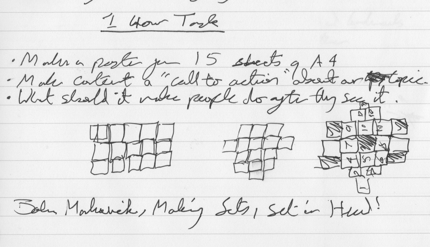
This is a postcard about the importance of conversations that evolved from something I made at uni as part of an hour long brief in early December last year. This brief involved creating a poster in black and white, using 15 A4 sheets and displaying any phrase we wanted. It had to relate to our project title, back then mine was ‘journeys’, long before it became ‘graphic props’. The time limit given made this brief hard as 1 hour from concept to finished outcome isn’t easy, so I began by thinking of a phrase as this would be a good place to start and could then inform the design of my poster.
After making a few gifs the week before, showing ways people say goodbye, which happened to be a forerunner of my “21 Ways To Say Goodbye’ gif video, I had become more interested in exploring ways of communication. I took English Language A-Level and remember studying how important simple conversations are to keeping language alive and so came up with a statement promoting people to talk to each other. “The small conversations are still important! Don’t let language disappear, keep language alive!” As time goes on, digital communication makes more and more of a presence in everyday life. If we want spoken language to keep evolving, changing and expanding, we need to use it regularly and all conversations, no matter how small, help do that. Perhaps go and talk to your sister who’s just on the other side of the room, rather than avoiding it and texting her instead.
I made several sketches to work out the arrangement of my 15 sheets of paper as it was a deliberately awkward number to design on. To fit on 15 sheets, I chose to keep my design rectangular and just leave off the top right corner as this negative space could represent language disappearing.
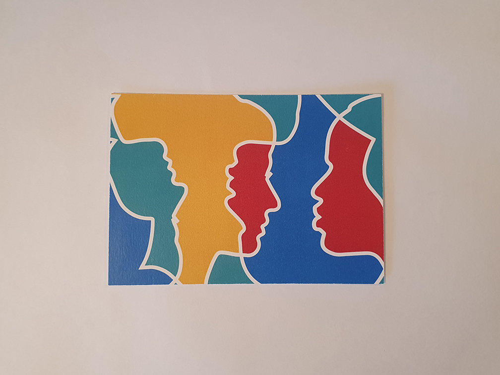
I then needed some quick inspiration for my poster and decided to draw on Gilbert and George’s design work. Gilbert and George are an Italian and British art duo who have worked together on colourful, creative and crude art projects since the late 1960s. Even though I’m not a fan of their art work, it is bold and I drew on that for my design. This also inspired me to draw on the art of my own Grandpa, John Nicoll, who often paints similar bold figures.
For the image part of my poster, I decided to design it in colour first so I could use a colour variation if needed. I chose a lightly muted selection of four colours, similar to the ones both my Grandpa John and Gilbert and George use; Red, Green, Blue and Yellow. I wanted two people to look like they could be communicating, but in an abstract way so I used images of two people’s faces, a black man and a white woman and vectorised their silhouettes to make my characters. I placed my faces inside one another so they visually overlapped, allowing me to play with the colours in the gaps. I gave my faces a large white border for clear definition. I duplicated, flipped and placed a second set of faces to the left and right, behind the first two. I also played with colour on those overlapping gaps too. This overall design gave a playful and abstract indication of communication that I was quite proud of.
For my text, I split my phrase into two sections and placed them at each corner of my poster design so it balanced. I used ‘Apple Symbols, Regular’ for light weight type to represent “The Small Conversations” text. This was a simple but good use of the font to help the message come across. I needed something bold for the rest of my text so I chose ‘Ariel Black’. Both of these were clean and readable sans-serif typeface and so good for large posters that should be read from a distance.
I then adjusted my poster to fit onto A4 sheets and made it black and white. I printed it onto 16 pieces of paper and put them up on the wall (leaving out the top right one) with everyone else’s from our class. I was seriously happy with the design considering I came up with it and produced it in just 60 minutes. If I was to do it again, I might play with the arrangement of pages more as the rectangle was quite dull in fairness, but the time restraints made this difficult to give time to consider.
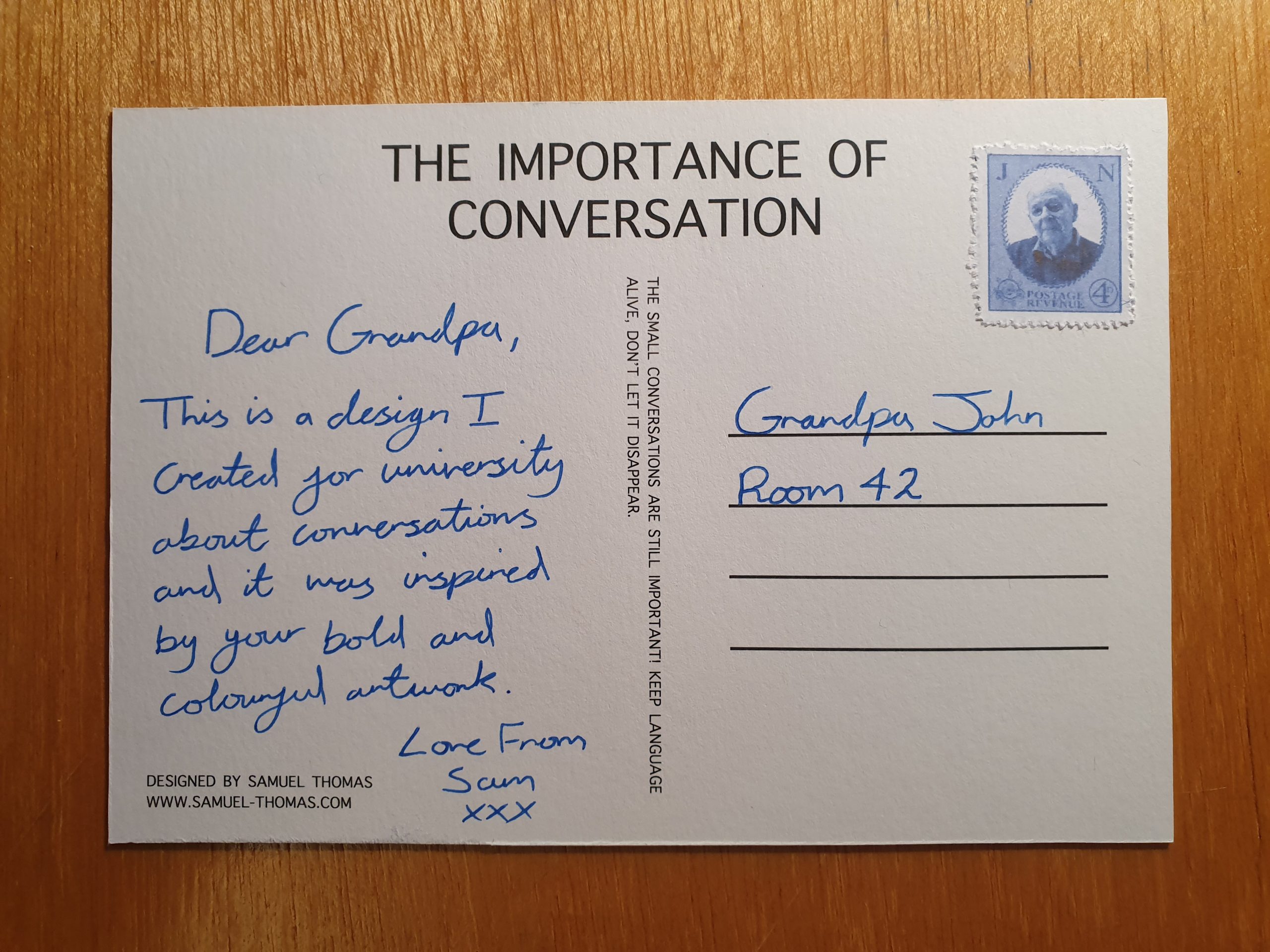
Following on from this task, a few days later, I adapted my design into a postcard as I felt it had potential. I removed the text from the front, leaving just the bold faces and then designed a back for the postcard, which contained the text and information I’d just omitted from the front. This worked really well and I produced a few, including one for my Grandpa who partially inspired the design in the first place. I also used my graphic prop making skills to design a little vintage stamp with his face on it because I could. Grandpa really liked the design and put it up in his room at the nursing home which was really lovely.