Design Process Of: Henry Higgins’ Newspaper Clipping
DESIGN PROCESS OF: HENRY HIGGINS’ NEWSPAPER CLIPPING
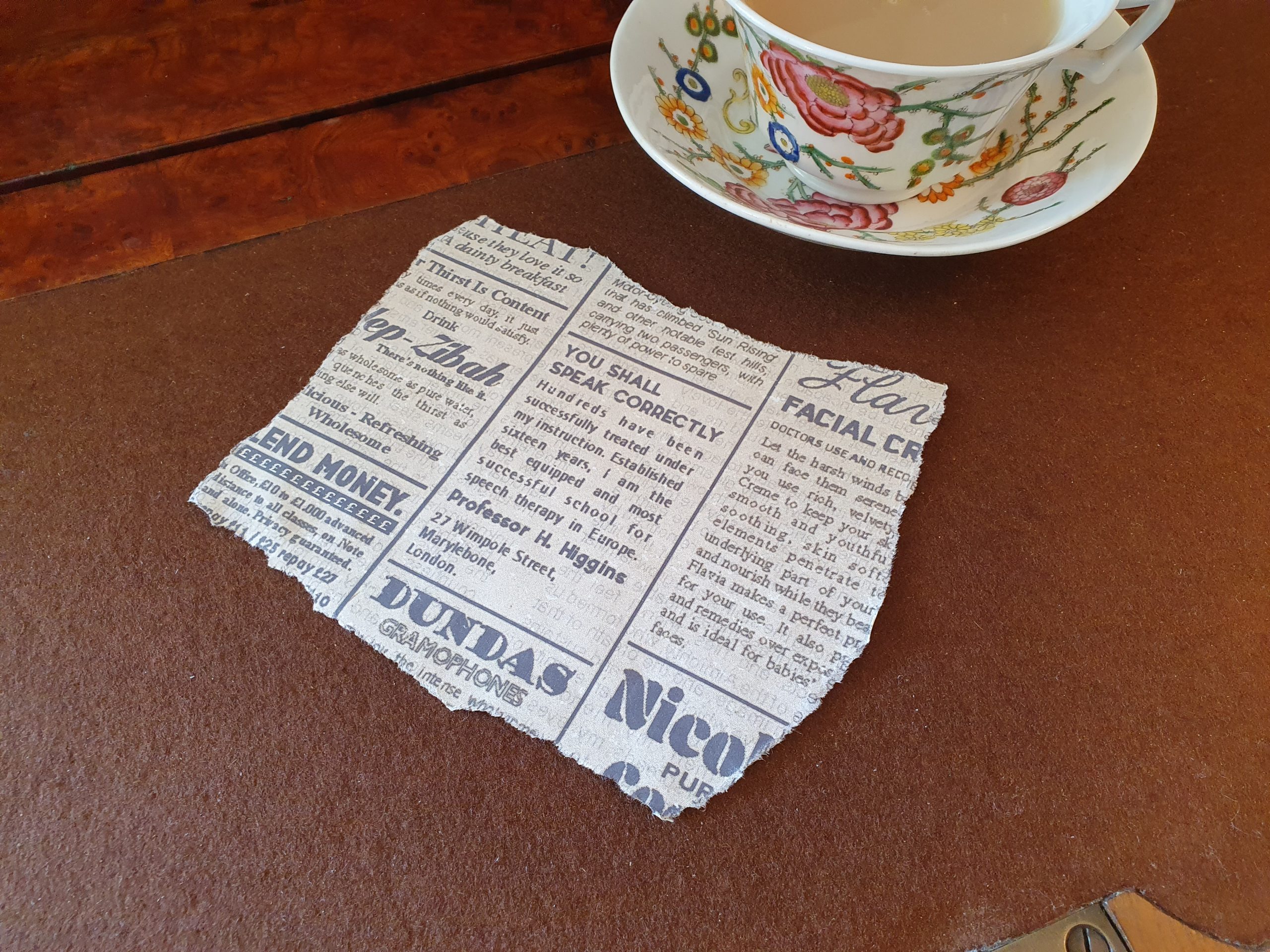
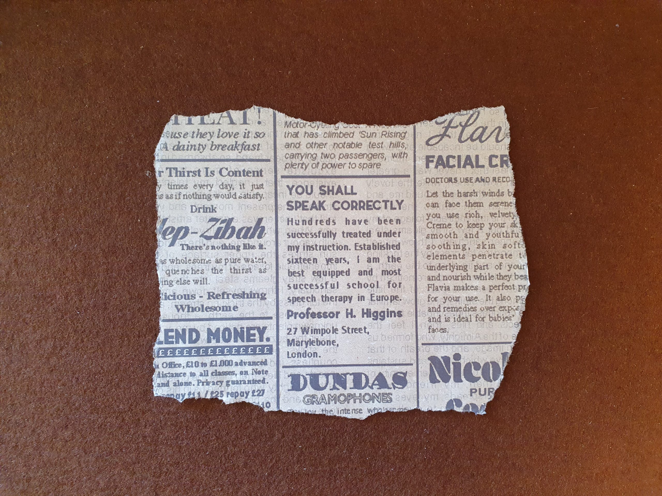
This is a newspaper clipping graphic prop I made as part of my “Eliza’s Ephemera” project in my final term of university last year. The clipping advertises speech lessons by Professor Henry Higgins and I thought it would be something Eliza Doolittle might have cut out and kept after using it to find his address.
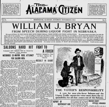
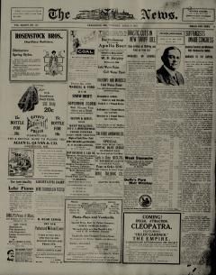
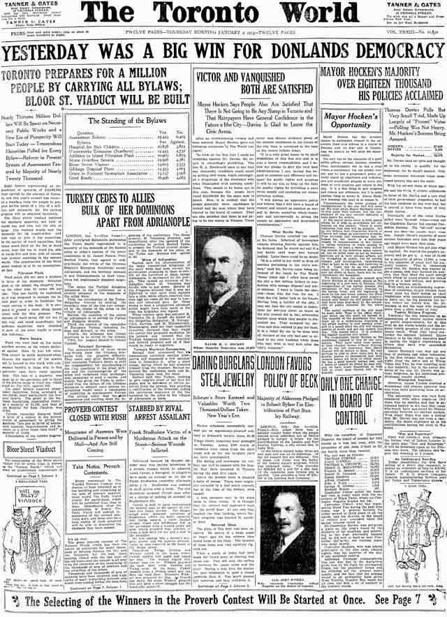
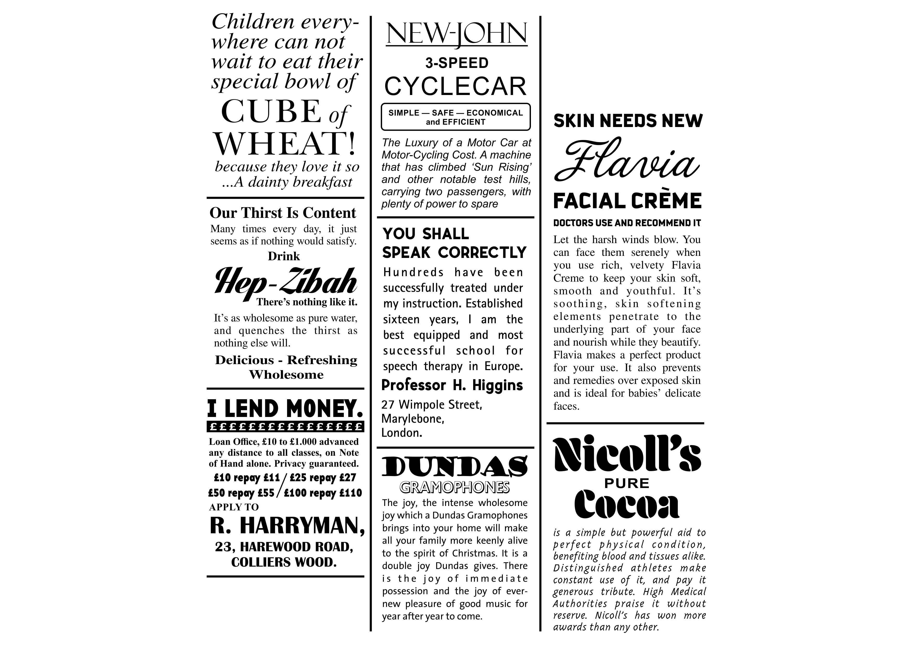
I began with research into existing newspapers of the time. Elements I noticed that featured in all were: An inconstancy of typefaces in almost every article and advert and many dividing lines were used to separate articles and adverts. I read some of these late Edwardian articles to get a flavour for the language they used too and discovered just how long winded they were.
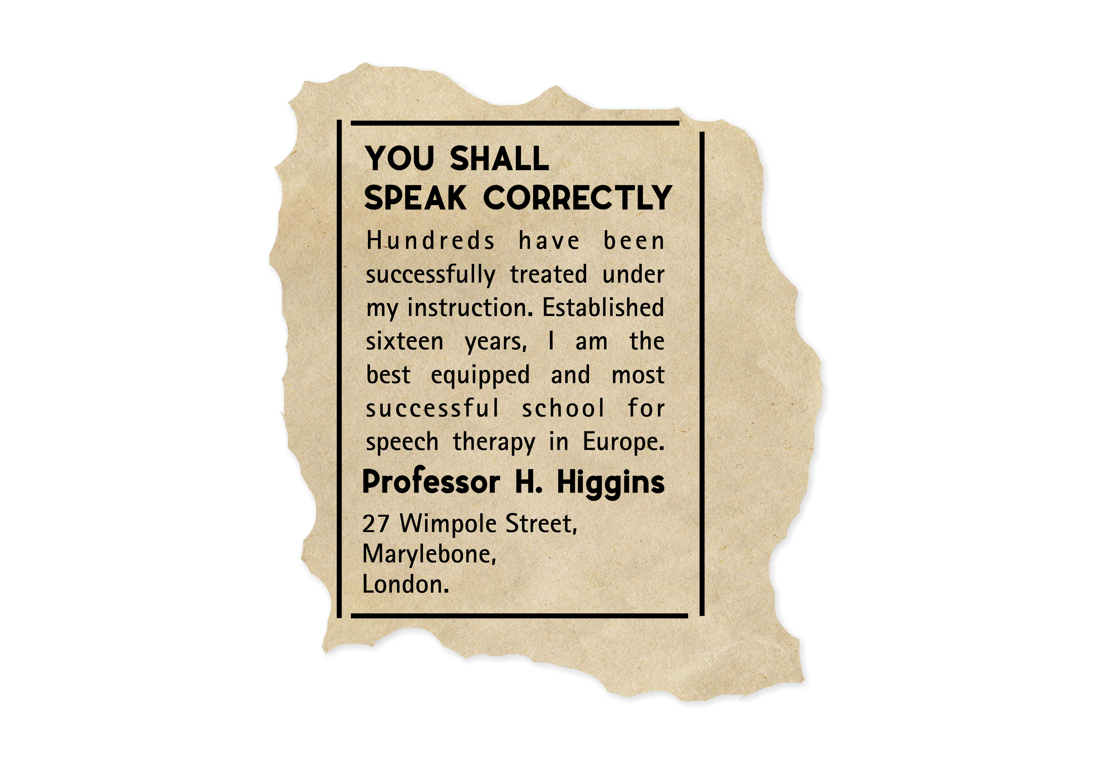
I planned to first design the central advert by Higgins, then design more ads around it to fill out the space, so when the article was torn it would look like it came from a real, much larger page. I began by writing out a headline. I chose something that sounded to the point, a little rude and demanding, “You shall speak correctly”, as that’s the tone in which Professor Higgins generally speaks those who he believes are beneath him. I used a blocky, sans-serif typeface called “Airfly” for this headline as it was clean, simple and stood out on the page. I also wrote Professor Higgins name in “Airfly” lower down the page, partially because this is an important piece of information in the advert and partially because Higgins is a quite self-important person and probably would have requested this.
I then drafted the body text of the advert, making it slightly rude and proud to fit Higgins’ character. For this I used another clean typeface as these sans-serif fonts were used at the time for more forward-thinking people and products. “ATRotisSanSerif” in its “bold” weight was my font of choice. I added some dividing lines, a newsprint textured background and then roughly digitally cut out my article to see how the finished item might look and check I was on the right track. I’m was happy with it so far.
Next, I had a lot of fun coming up with fake companies and other adverts to surround my clipping. “Flavia facial creme” was named after a character from the TV show Plebs and is a spoof on the brand Nivea, which originally started advertising in 1911. “Help-Zibah” is reflective of a Coca-Cola style drink and named after an obscure character from Harry Potter. “Cube of Wheat” resembled vintage Weetabix ads. The “Nicoll’s Pure Cocoa” and “New-John 3-Speed Cyclecar” ads were named after my late Grandpa. The “R. Harryman” Money Lenders and “Dundas” Gramophone company were both named after friends from secondary school. I used a range of typefaces and fonts for these adverts like the examples of original newspaper clippings from my initial research.
I also wanted to print something on the reverse of the newspaper clipping to make it more realistic. I wrote a little article / story and split it into two columns, like the real articles I studied.
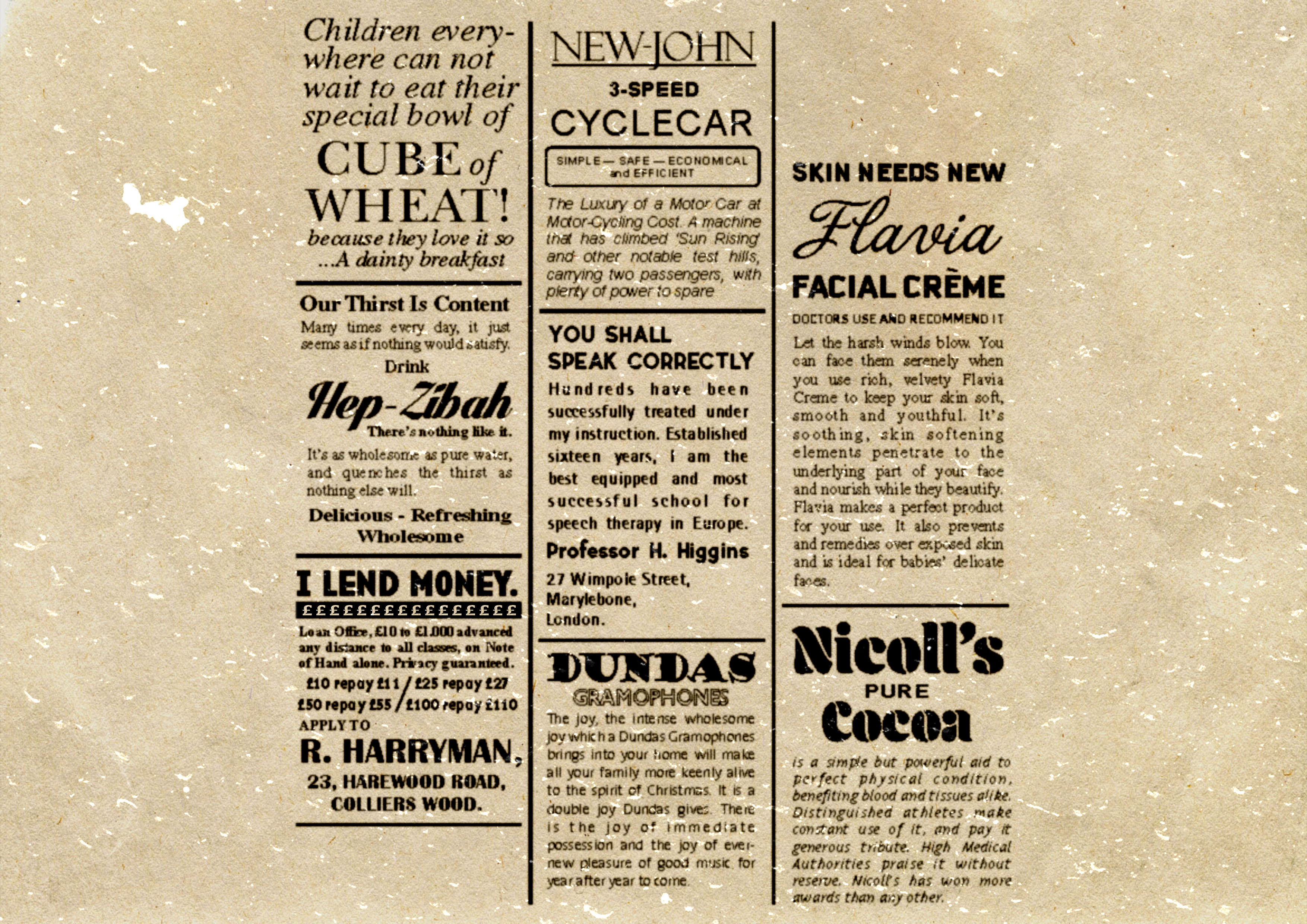
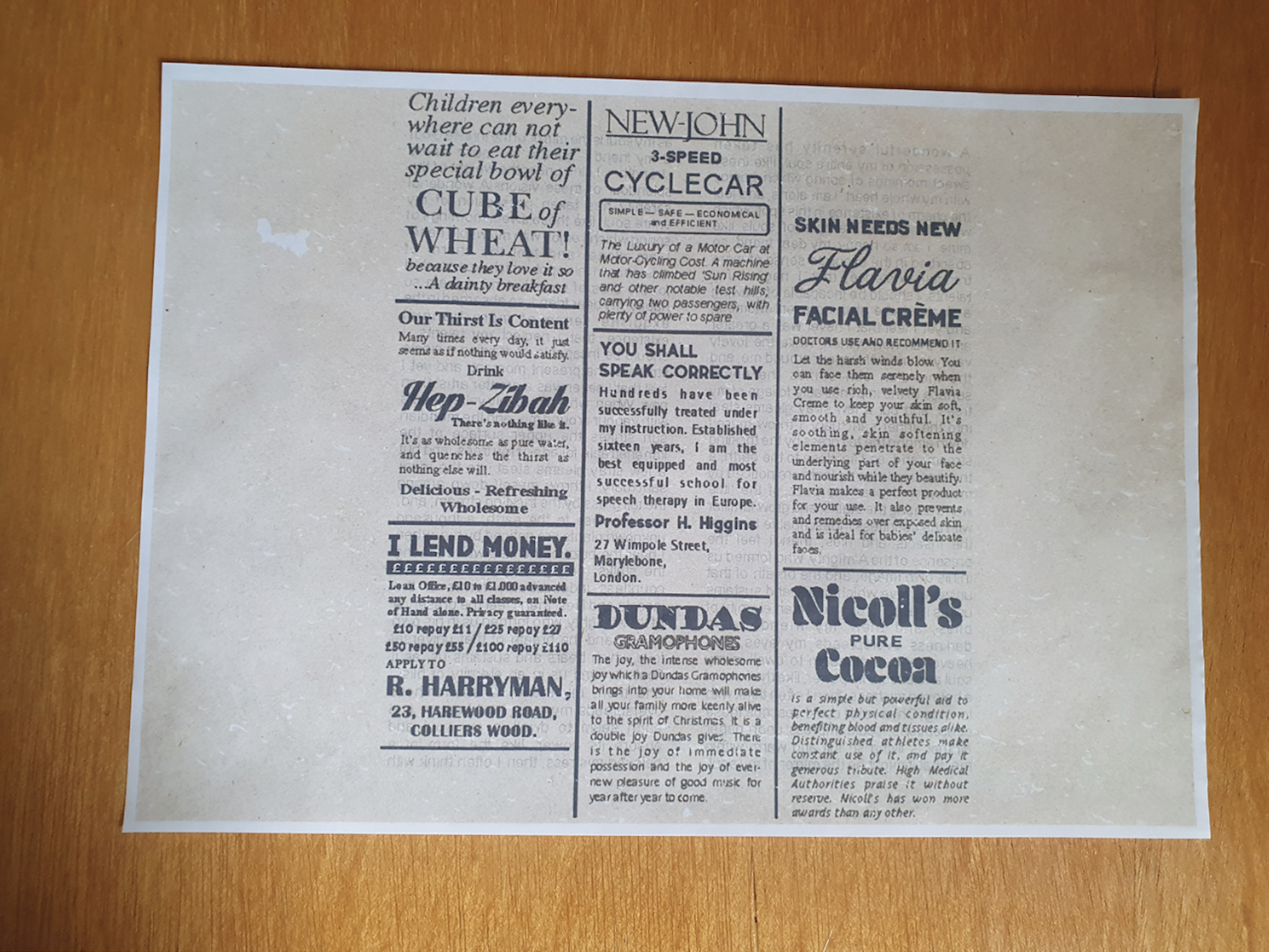
I didn’t have any newsprint paper stock at the time so I decided to print my design onto plain A4 layout paper which is very lightweight (60gsm) and would feel like newsprint when finished. To emulate the newsprint look, I applied a yellowed, rough texture background behind my adverts and article and added a white, gritty overlay on-top to simulate age. I also turned my vector design into a bitmap image at 150dpi which made it slightly pixelated and fuzzy, giving the effect of making it look cheaply made. I finally inkjet printed my design onto the layout paper which really looked the part.
I took several copies of my print and tried tearing it to look naturally ripped and curved. I wanted to roughly centre the article in the middle of the piece. I tore one but it looked too neat and lost the other articles around it. Although I wasn’t trying to show off my work, the other articles around the edge help the believability so I took another copy and tore a much wider space around the central article. This both looked more natural and helped the page stand up to Eliza’s other graphic props I’d made in size.
I am still, a year later, very happy with how realistic the final outcome looks. I really like making graphic props because they are almost always designed around a character and like an actor, I love getting into a character’s mindset which I then use to influence my work.