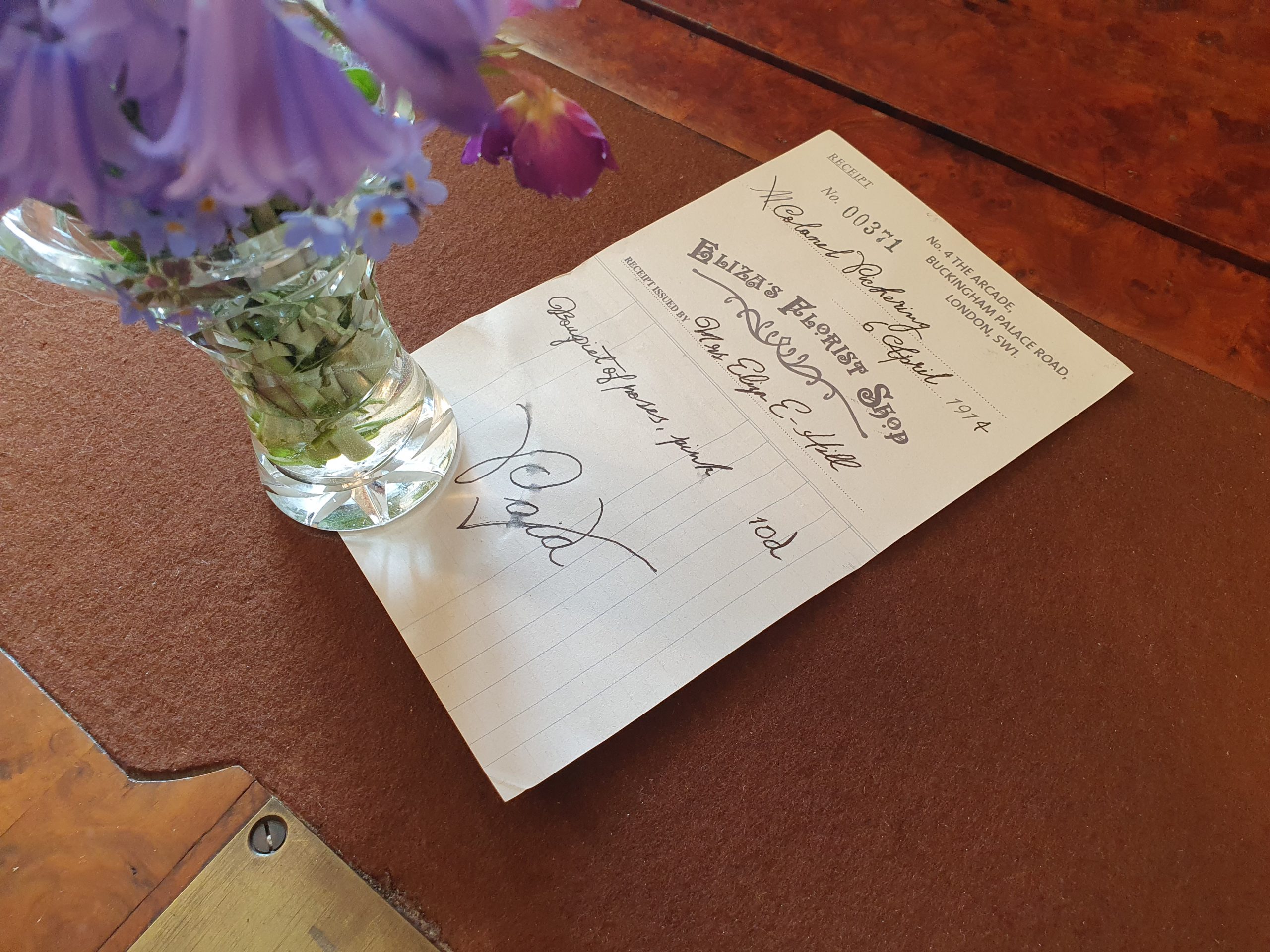
This 1914 receipt was made as part of a collection of ephemera that Eliza Einsford-Hill (née Doolittle) might have kept after the events of the play ‘Pygmalion’ (1913) and the film ‘My Fair Lady’ (1965).
I started by researching examples of 1912 receipts online and looking through a huge collection of ‘60s and ‘70s receipts I recently inherited from my grandmother. My online research gave me ideas about design and style and the ‘60s ones gave me examples of paper stock and physical feel as they didn’t change much over those 50 years. Some key design elements I took away from my research were: They were almost always rectangular, the handwriting was elegant but messy as they were quickly written, and most were printed in black ink.
My plan was to design a receipt from a sale relatively soon after Eliza opened her flower shop. I thought it could be the shop’s 1-month anniversary and I could date it the 6th April 1914. (April 6th is my birthday so that’s a fun little detail.) A close friend of Eliza’s in My Fair Lady is the kind Colonel Pickering who might have popped in and bought a bouquet of flowers to celebrate the shop’s 1-month anniversary and say hello to Eliza. Being a friend, he wouldn’t have needed to keep the receipt, but sentimental Eliza might have as a memory of the shop’s early days and her friend Pickering.
I began by designing the shops logo, I wanted to create something fun and decorative as that’s what Eliza would have chosen. She would also have understandably wanted to name her shop after herself and call it Eliza’s Flower Shop, as she used the word flower shop several times during the film and play. But when consulting her upper-class friends, Henry Higgins and Colonel Pickering would have said call it by its proper name, a “florist shop” and omit the name Eliza. Overall, I think they might have compromised, settling on “Eliza’s Florist Shop”. This is the kind of detail and character thought designing for film requires. Luckily, I enjoy it.
For the actual design of the logo, I knew it was going to be simple and black in colour. I chose to use the typeface “Apollo ASM” as it’s very evocative of the art nouveau style. My early research showed that in 1912, design in Europe was still mainly influenced by the art Nouveau movement so graphics, art and furniture still took on a more decorative and floral aesthetic.
This fun, elegant typeface was perfect. I added a slight upward arch to the text to evoke positivity and also reduced the size of the letter “o” and added a dot underneath. This was a common technique used to save space on signs and logos if the words were too long for the space given. Being simple, wide and symmetrical, it’s one of the clearest letters to read on a small scale, making it a perfect letter to reduce in size. This makes words sizably shorter without needing to reduce the overall point size. A dot would usually be placed underneath to fill the empty space and stop the letter looking like it’s just floating. Although I didn’t need to augment the letter “o” I thought it was a nice aesthetic and period affirming touch. To finish the logo, I drew a decorative and stylised floral shape, which I think grounds the letters an brings the whole logo together nicely. I’m proud of this logo and name, as a lot more thought went into it than I originally imagined it would need.
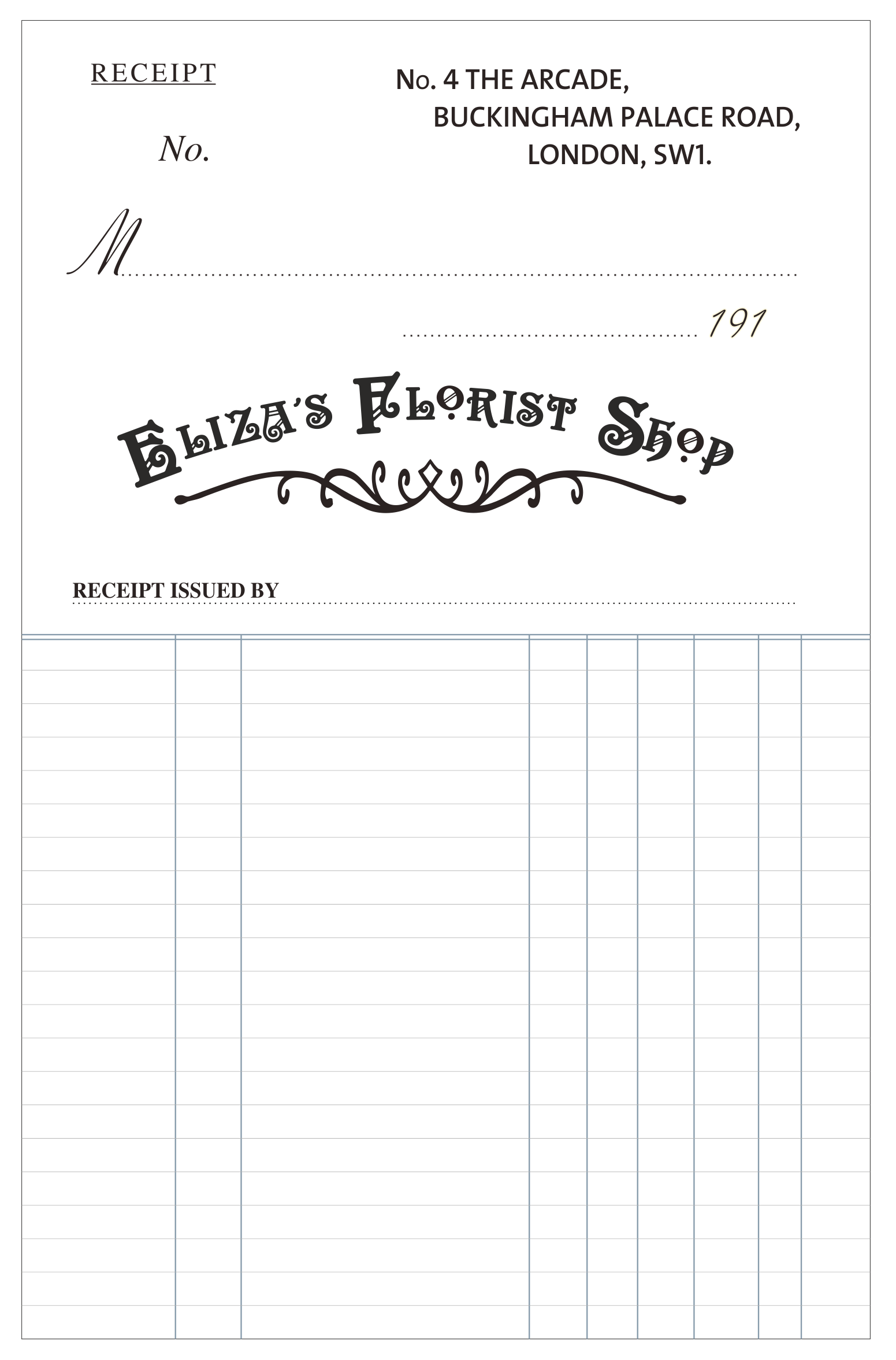
I began the receipt’s layout design by coming up with the size, 125mm x 195mm. This is an average size for the time because receipts were larger than today as they had to be filled out by hand. In terms of layout, I chose to place the important information at the top of the page and the shop name about a third of the way down. I then added a row of faint lines for writing the purchased items and cost on. I placed a double line at the top of the section to indicate the change in function and tinted the heavy lines navy blue to make a slight feature of them and give them some character.
Next, I needed to find an address for Eliza’s shop. In the play it’s by Victoria Station, so I used Google maps and found an old Arcade which is still full of shops and thought it would be the perfect place. The address I chose was, “No. 4 The Arcade, Buckingham Palace Road, London, SW1.” I placed the address in the top right of the page like most other receipts and offset the 3 lines so they weren’t cleanly justified but still looked balanced. I used the sans-serif typeface “TheSans” in the font “SemiBold”, in all caps for this, so it was clear and would stand out, as the address is one of the most important elements on a receipt.
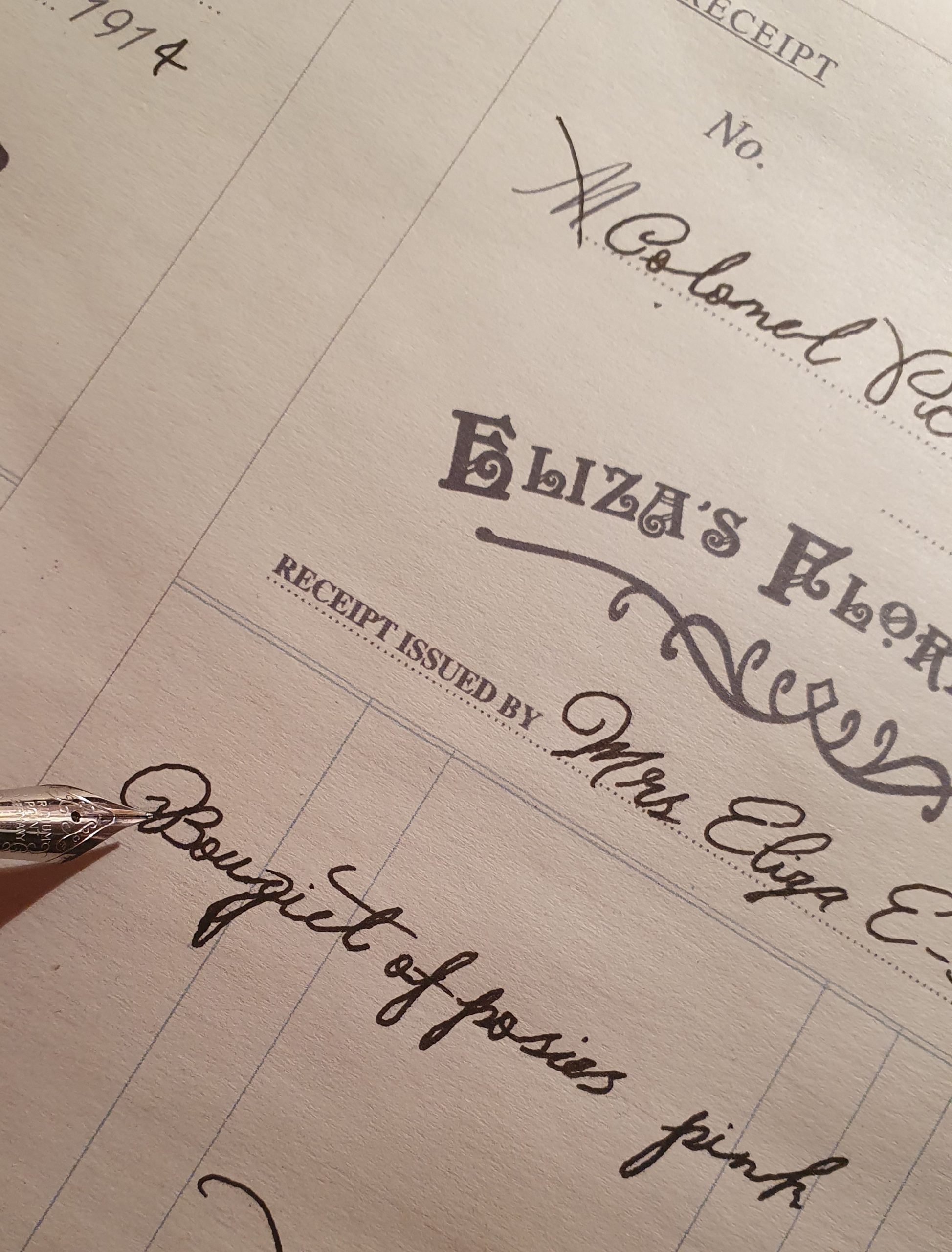
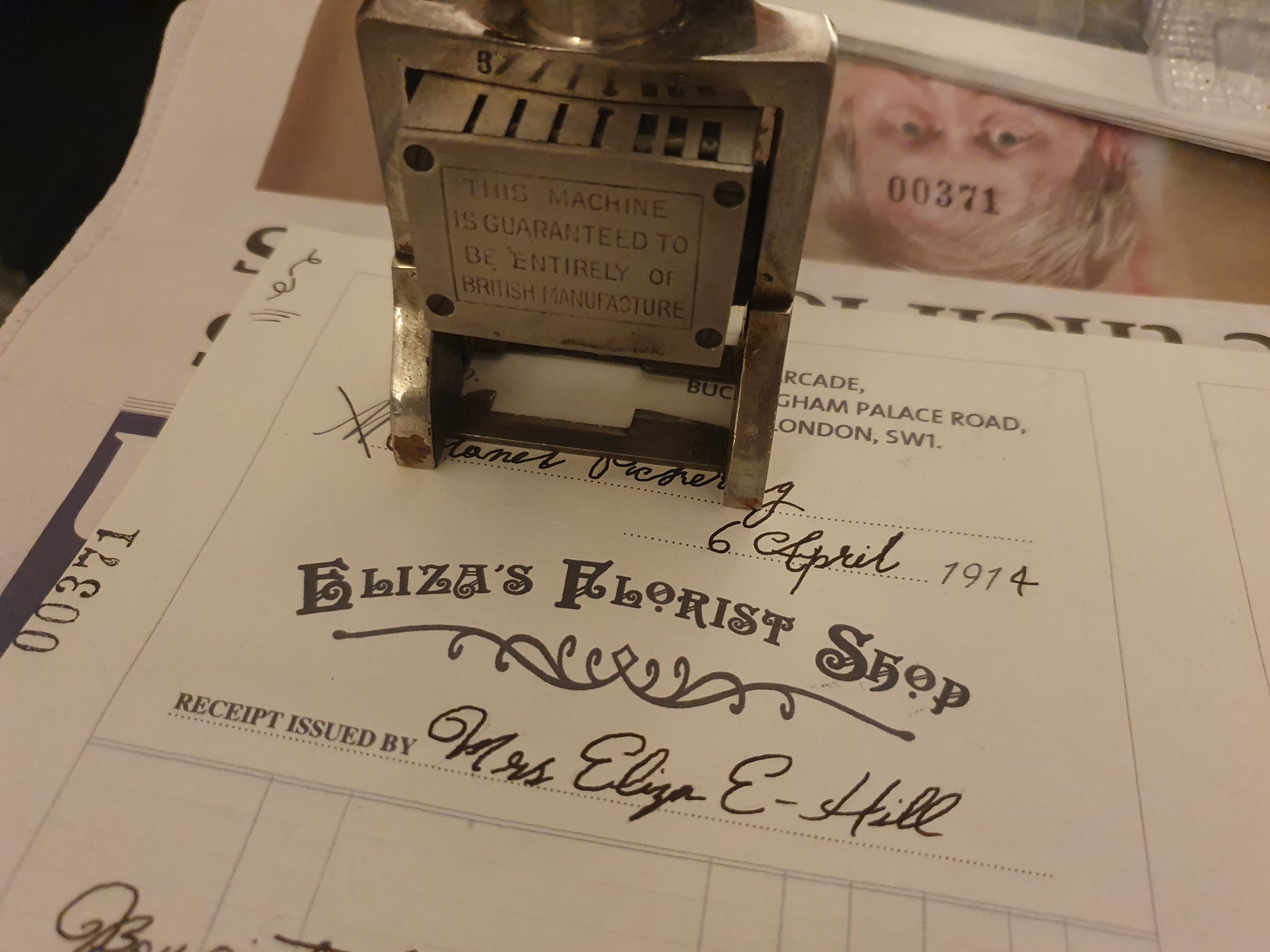
I then chose the simple serif, “Times LT Std” to write “Receipt”, “Receipt Issued by” and sale number “No.” in italics. I left a gap for a physical number stamp which I would add once printed. I then used a classic script typeface “Freestyle Script” for the issue date as I wanted it to be elegant and complement the seller’s handwriting. As sellers usually had to add in the year’s final digit by hand, I chose to design my receipt like this too. I used a similar script typeface called “Ministry Script” for the pre-written “M” next to the buyer’s name. This represents the titles, Mr, Miss, Mrs etc… But as this receipt was for Colonel Pickering, I thought it would be a nice touch to cross it through with the pen on the final printed item.
My range of typeface choices for such a small item might seem shocking, but in reality, when put together carefully, they can give an amazing quality to a piece of design. Most paper items at the time would have been printed using a letterpress and as printers only had one or two sets of each typeface or font, they’d have to mix many different styles of lettering on one item. This created the exciting look vintage playbills have and the same goes for receipts.
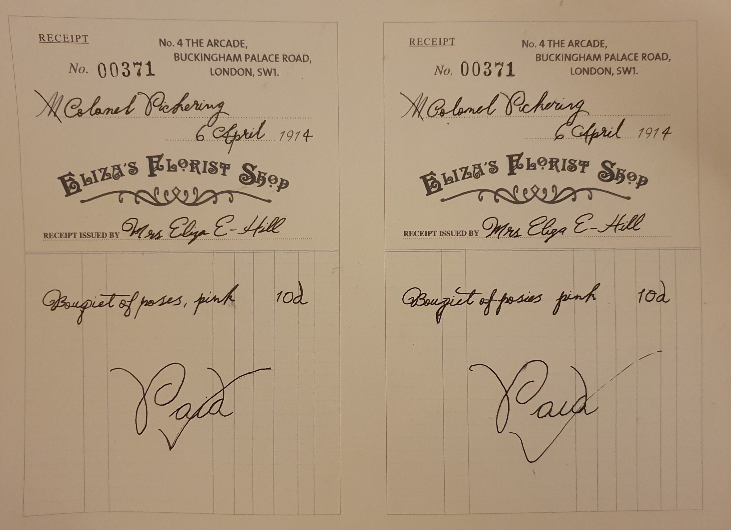
I then moved onto paper stock choices and printing. I chose to use a sheet of thin, 90gsm, uncoated, recycled paper which had the perfect natural texture and yellowy-brown tone to it. I printed two on one sheet to make the most of the paper, also meaning I could hand write two and choose the best / most realistic one as the final prop.
Eliza’s handwriting, I based on a slightly scrawly typeface called “Sudestada”. I chose it because Eliza grew up poor and not well educated, towards the end of George Bernard Shaw’s play ‘Pygmalion’ he writes that Eliza wasn’t very accurate with her spelling or maths when working in her shop. I practiced writing in the style of the typeface by hand a lot until I could form words naturally. I then started on my printed receipts and wrote the text freehand using a dip pen and black ink, keeping faithful to the time.
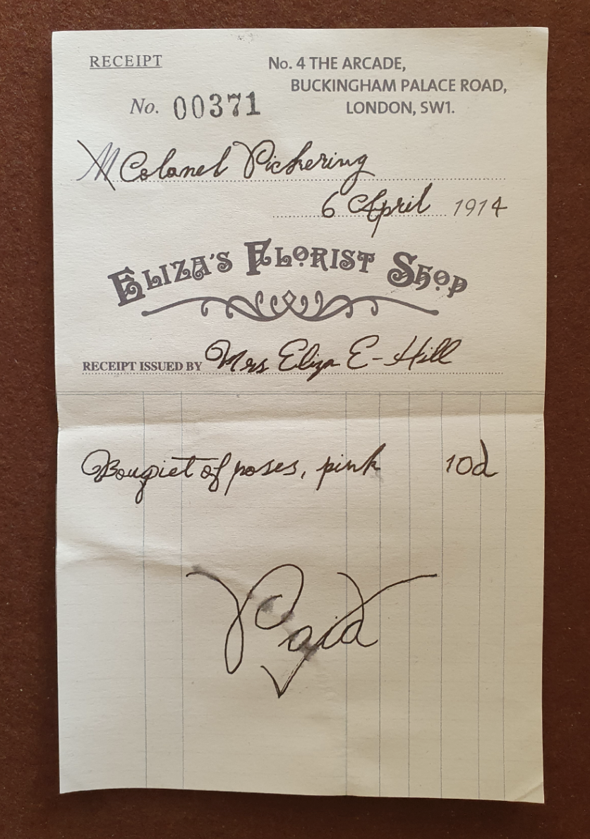
When writing out Eliza’s married name, I had to shorten Einsford-Hill to “E-Hill” as the line wasn’t long enough and I actually felt this added to the realism of the piece. I thought Pickering would have purchased a bouquet of pink posies from Eliza, so I wrote “Bouquet of poses, pink” and for the pricing I used the online article, “Cost of Living in 1910” as a guide. I priced the bouquet at 10 pence or “10d”, which was average for the time. When writing by hand, I only loosely followed the printed lines as in all the real examples I studied, everyone disregarded them and just wrote over the top as if it was blank. I also wrote “Paid” quite large at the bottom of the page with a tick. This quirk I spotted on several real vintage receipts as an indicator that the seller had received payment.
For the stamp, I used a real vintage number stamp that my family inherited. I cleaned it up and arranged the numbers to read 00371 as I thought this might be about the number of purchases the flower would have received in the first month of being open. I tested the stamp to get a feel for pressure and then stamped both receipts. The first one was at an angle and the second straight on. I chose to use the first receipt as the slight angle made it look more natural and added to the charming imperfections. I cut out my chosen receipt from the sheet and folded it in half, slightly askew, to give it a used effect.
To add a finishing touch, I give it a water stain, as in a flower shop a pot or vase might have been accidently placed on it before Eliza picked it up and decided to keep it. To do this I lightly dampened the edge of a round pot and pressed it on the edge of the paper. I then brushed on a little more water, making sure there was a definite light line and running ink. Once dry this was great and I really liked the effect.
I was thrilled with the final receipt and it really helped me get into the character of Eliza Einsford-Hill (née Doolittle). This was just one of many graphic props I made for Eliza’s ephemera collection and I might share how I made some of the other items in due course. In the meantime, check out these links to the finished collection of Eliza’s ephemera, the video of her looking at the items and a blog about the filming process…